Casa Olmo

Services

CD

Concept & Schematic design

HM Architects

DD

Design development

HM Architects

CD

Construction documents

HM Architects

CA

Construction Administration

HM Architects

ID

Interior design

HM Architects

Abstract

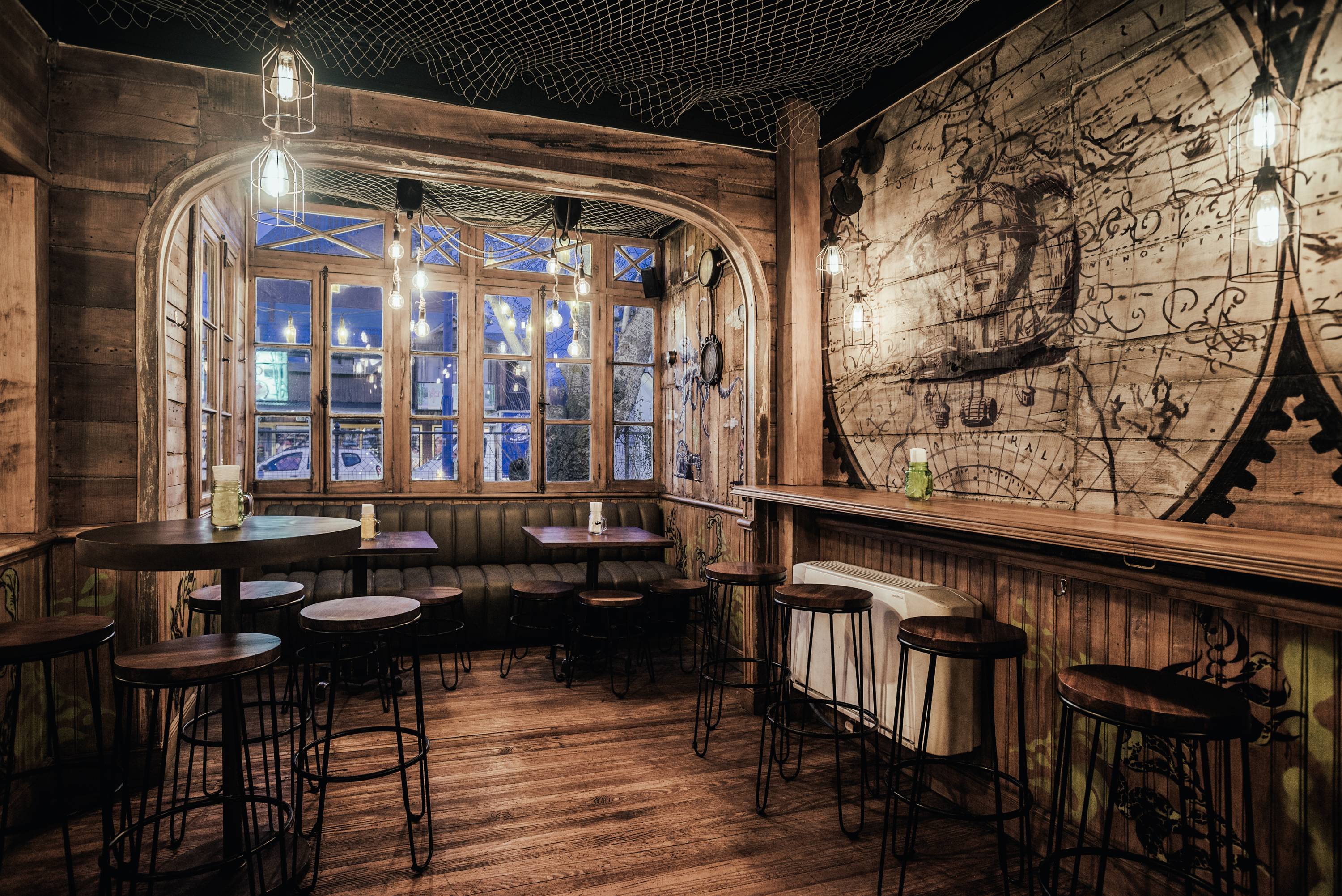
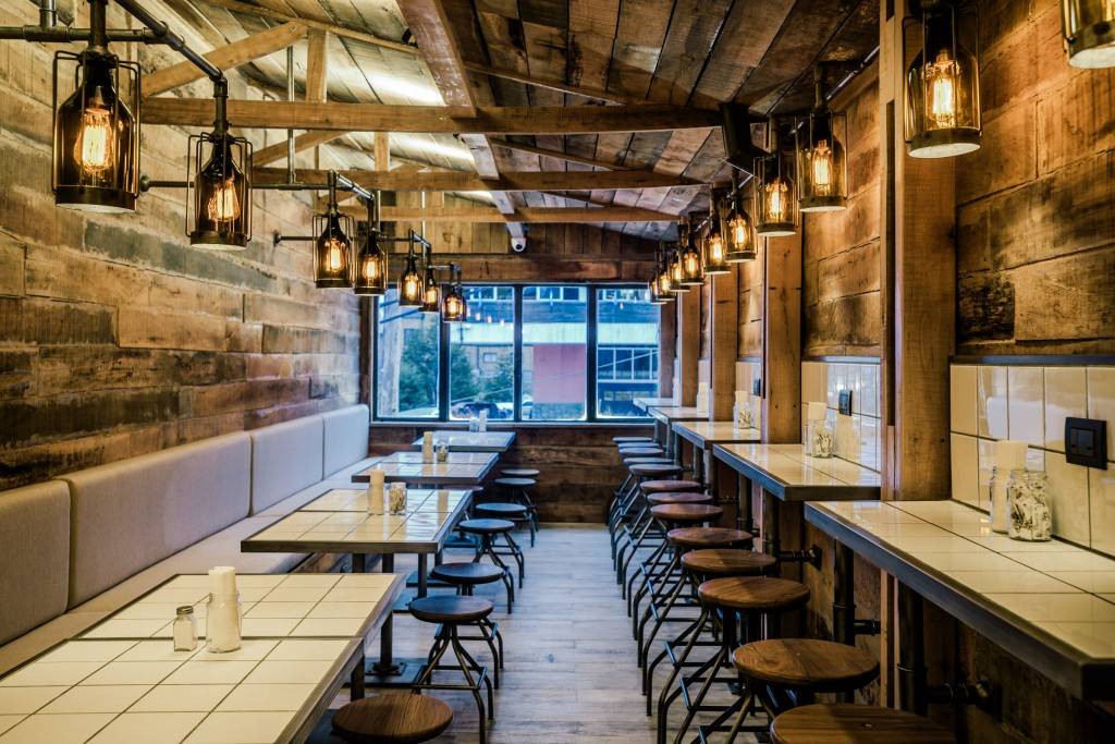
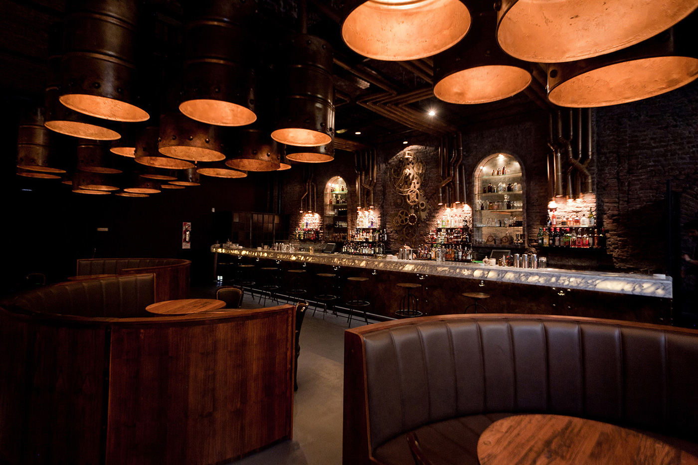
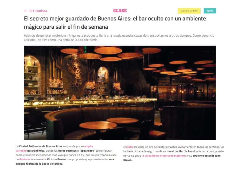
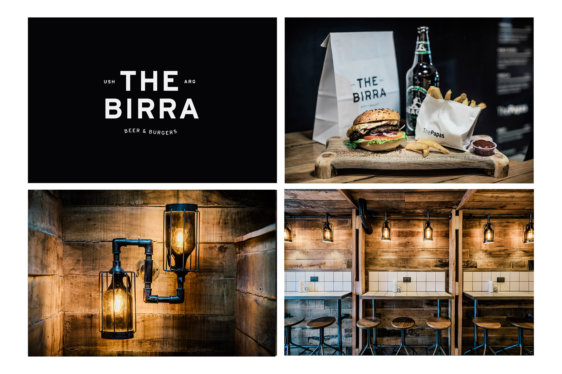
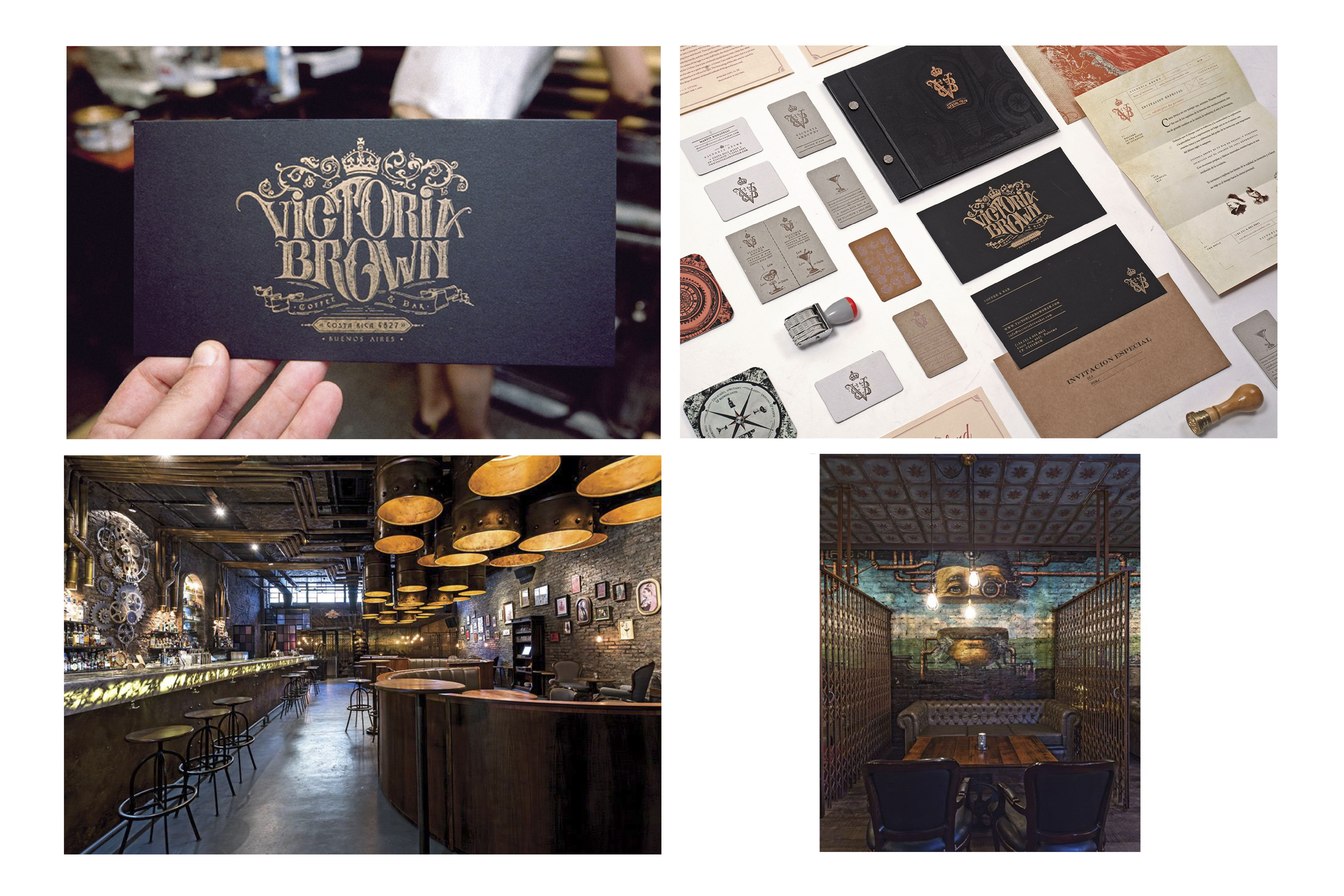
The project is located in the southernmost city in the world, Ushuaia in Patagonia Argentina, where his hostile nature, icy and wild waters enclose the great tales of Darwin. Its port is the place that shelters the traveler and this magical universe has inspired us in our work. The client’s demand was to intervene a house of the early twentieth century respecting each of its areas, intervening only with ambiance. The house is typical of the area, belonging to the Olmo family, the first villagers of this city.

Cape Horn just 43 km away from the city, was the trigger that lead us to recreate the idea of a magical underwater world, similar to the illustrations of Jules Verne, where the machines of another century and landscapes are the protagonists. We created aquatic creatures, seaweed, scapers and we fuse it with port elements such as compasses, eyes of ox, through pipes, where both the graphic and these elements make up the imaginary of space.

We construct the illumination through nautical pulley wheel with cords, and we used old cartographic images adapted for different spaces, painted in a mural and wallpapered in the bathrooms. The intervention in the bar is made with old beer barrels, inspired again in the beer brand sponsored by the bar, Cape Horn, manufactured in these latitudes. The furnishing equipment with industrial aesthetics accompanies the idea of bar, whose language fuses a very closely related universe with its location, southern, wild and magical.

Publication

/ Local & Global

The Birra

The Birra

Services

CD

Concept Design & Art

HM Architects

DD

Design development

HM Architects

CD

Construction documents

HM Architects

CA

Construction Administration

HM Architects

ID

Interior design

HM Architects

Abstract

The project is located in the southernmost city in the world, Ushuaia, in Patagonia Argentina where the city’s architecture is typical of a port city one. The location was determinant in the choice of materials. This means that the materials used are mainly native due to the distance from the most dynamic and urban centers of the country. That implies a very rational use of materials, which are mostly wood and steel sheet. It is an architecture that appears to have stayed in time. The interiors are also mostly of wood and balloon frame structure. The project started with the idea of a diverse and varied grocery (traditional Argentine warehouse) through wooden boxes, and its “star” product, beer bottled in growlers. The decision to involve growlers as electrical appliances and wooden boxes as shelving is an example of an intervention with elements specially designed to create an aesthetic proposal, that was absolutely related with the type of products marketed.

Lenga, authentic wood from the Argentinean Patagonia, was chosen as inner siding of the first floor. The blackboard painting was chosen to cover the ground floor and considered also as a way of communicating information about the products for sale. The project brings together two materials, wood and white tiles, to balance the palette of materials so that it does not rely solely on wood colors. The distribution was a great challenge since the space only has 90 m2 and a width of barely 2.75 meters in ground floor and first floor. In the ground floor the idea was to build a self-service and take out area, in response to the clients´ request of giving the space a flexibility that would invite different types of consumers. The first floor is distributed in a range of different uses: low tables, bars, living.

Publication

/ Local & Global

Lucciano's Olivos

Lucciano’s Olivos

Services

SD

Concept Design & Art

HM Architects

DD

Design development

HM Architects

Abstract

The initial pursuit of the brand was to draw away from the preconception of the traditional ice cream shop and relate to somewhat unconventional aesthetics for this type of stores. Therefore, to bring the product and brand together with different forms of art was the path chosen as designers. Through the election of materials, lighting, equipment and some semi-sculptural elements, we were able to incorporate into the ice cream shop attributes that convey the comfort of domestic living and reminiscences of an art gallery or jewelry store. 

Through the development of different constructive elements – the hammered treatment of the columns that exacerbates the characteristics of concrete; the verticality of the black wood siding; the elaborate piece of iron and glass that serves both as centerpiece and railing of the upper level- the goal is to enhance the spatial qualities of the store an put the focus of attention on its double height.

The construction of a topographic art piece was in part a decision associated with the idea of ​​gastronomic product with relevance in the artistic concept. Its location was decisive for its protagonism.

The balance of old / contemporary, monochromatic / colorful, flat / textured, generates an interesting aesthetic eclecticism that at all times gives way to promote the product in question: frozen creams.

Publication project

/ Local and International

Lucciano’s Caballito

Services

CD

Concept Design & Art

HM Architects

DD

Design development

HM Architects

CD

Construction documents

HM Architects

CA

Construction Management & Contract Administration

HM Architects

ID

Interior design

HM Architects

Abstract

 The initial pursuit of the brand was to draw away from the preconception of the traditional ice cream shop and relate to somewhat unconventional aesthetics for this type of stores. Therefore, to bring the product and brand together with different forms of art was the path chosen as designers. Through the election of materials, lighting, equipment and some semi-sculptural elements, we were able to incorporate into the ice cream shop attributes that convey the comfort of domestic living and reminiscences of an art gallery. 

Through the development of different constructive elements – the hammered treatment of the columns that exacerbates the characteristics of concrete; the verticality of the black wood siding; the elaborate piece of iron and glass that serves both as centerpiece and railing of the upper level- the goal is to enhance the spatial qualities of the store an put the focus of attention on its double height.

The balance of old / contemporary, monochromatic / colorful, flat / textured, generates an interesting aesthetic eclecticism that at all times gives way to promote the product in question: frozen creams.

Publication

/ Local & Global

Victoria Brown

Services

CD

Concept Design & Art

HM Architects

DD

Design development

HM Architects

CD

Construction documents

HM Architects

CA

Construction Administration

HM Architects

ID

Interior design

HM Architects

Abstract

The design proposal responds to the construction of an industrial environment by using elements of the industrial revolution with certain interventions of a contemporary style classified as steampunk. The challenge was to balance the industrial compositional elements and some Victorian style elegance. Thiscriteria allowed us to generate our own DNA outside the thematic schemes.

The choice of “secret” entrance and exit doors, covered in brick for circulation, was a premise that responds to the concept of clandestine bar (Hidden bar). The fictitious brick wall suggests access to the bar. At night a sliding iron gate covers the entire façade, which is completely graffitied with the image of England’s Queen Victory, work done by graffiti artist Martin Ron.

The strategy in the use of three “stations” to shelter the distinctive areas is the spatial organizational axis of the project. These stations are made up of 12 intervened oil tanks. The connections between the stations and the bar, through pipes that run through the ceiling, emulate the concept of whisky distillers, which inside does not transit alcohol but light serving a lighting function.

The last room where the living room is located is subdivided through screens with old scissor doors, which can eventually be moved to change the distribution. On the back wall is painted the face of Mr. Brown, whose image suggests a story.

Two artifacts were built, which work and have movement. On the one hand a clock designed through vertical gears, and on the other hand an old 19th century machine.

Publication

/ Local & Global

The Birra

Services

A

Activation

Estudio Nuar

E

Strategy

Estudio Nuar

D

Design

Estudio Nuar

Tostado café club

Services

A

Activation

The Brand Bean

E

Strategy

The Brand Bean

D

Design

The Brand Bean

Victoria Brown

Services

A

Activation

The Brand Bean

E

Strategy

The Brand Bean

D

Design

The Brand Bean