
Accor Hotels
- Intervention
- Interior design
- Status
- Project
- Typology
- Hotel — international competition
- Location
- São Paulo
- Country
- Brasil
- Area
- 6.500 m²
- Year
- 2018
- Client
- Accor Hotels
- Team
- Arch. Fernando Hitzig
Arch. Leonardo Militello
It is impossible to ignore the fact that hotels today base all their proposals on thematic aesthetics and integration activities for the pleasure of their passengers, and this is an undeniable advantage over temporary spaces such as Airbnb. So why is Airbnb a threat to the hotel business? Why do most hotels base their proposals on themes? Nowadays Airbnb is like being at home; hotels, on the other hand, are a place of transit: despite the renewed thematic proposal, they all dress and undress according to fashion, without a specific identity. This explains a lack of IDENTITY.
Our proposal is summarized in two words: IDENTITY and COMMUNITY, both resolved as part of the operation and entertainment of the hotel. Identity is an integration of concepts that define an individual or thing, but the hotel should not have a defined identity: it should rather serve as packaging. A large skeleton where each passenger can fill it with their possessions, as in their own home. A truly tailored offer.
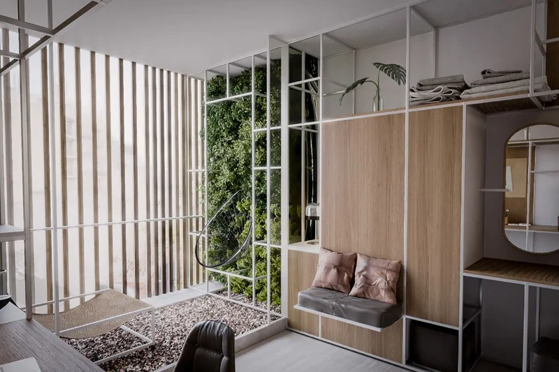
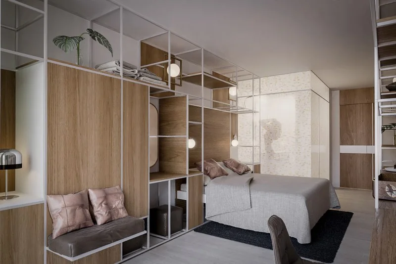
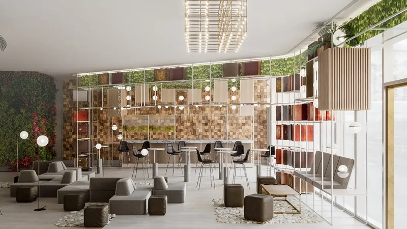
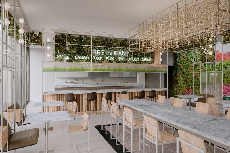
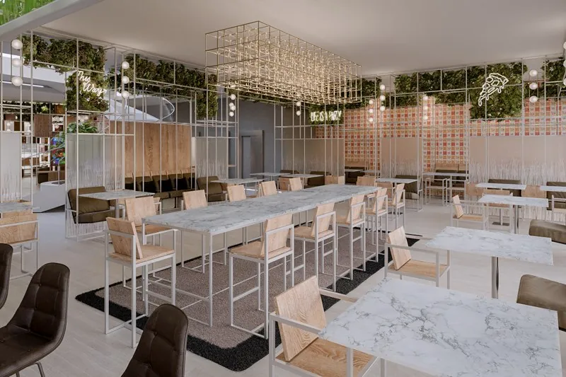
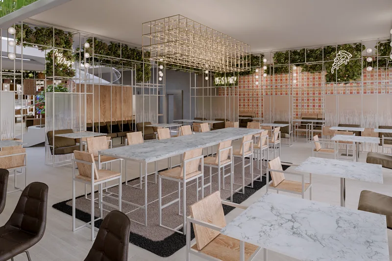
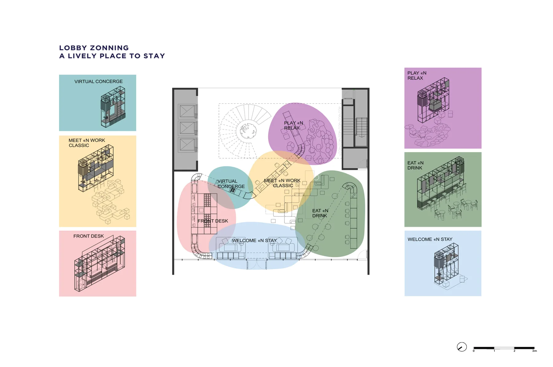
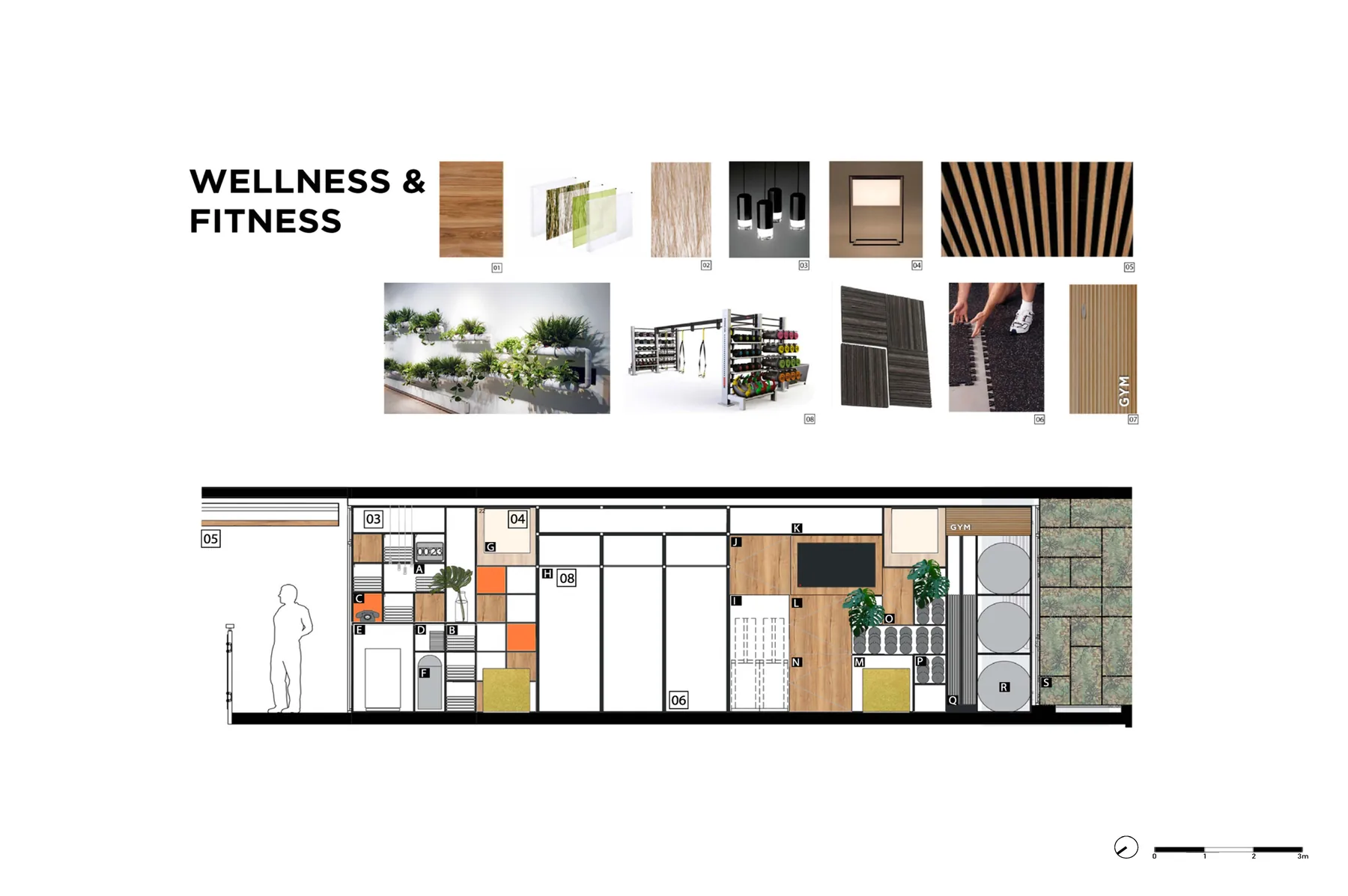
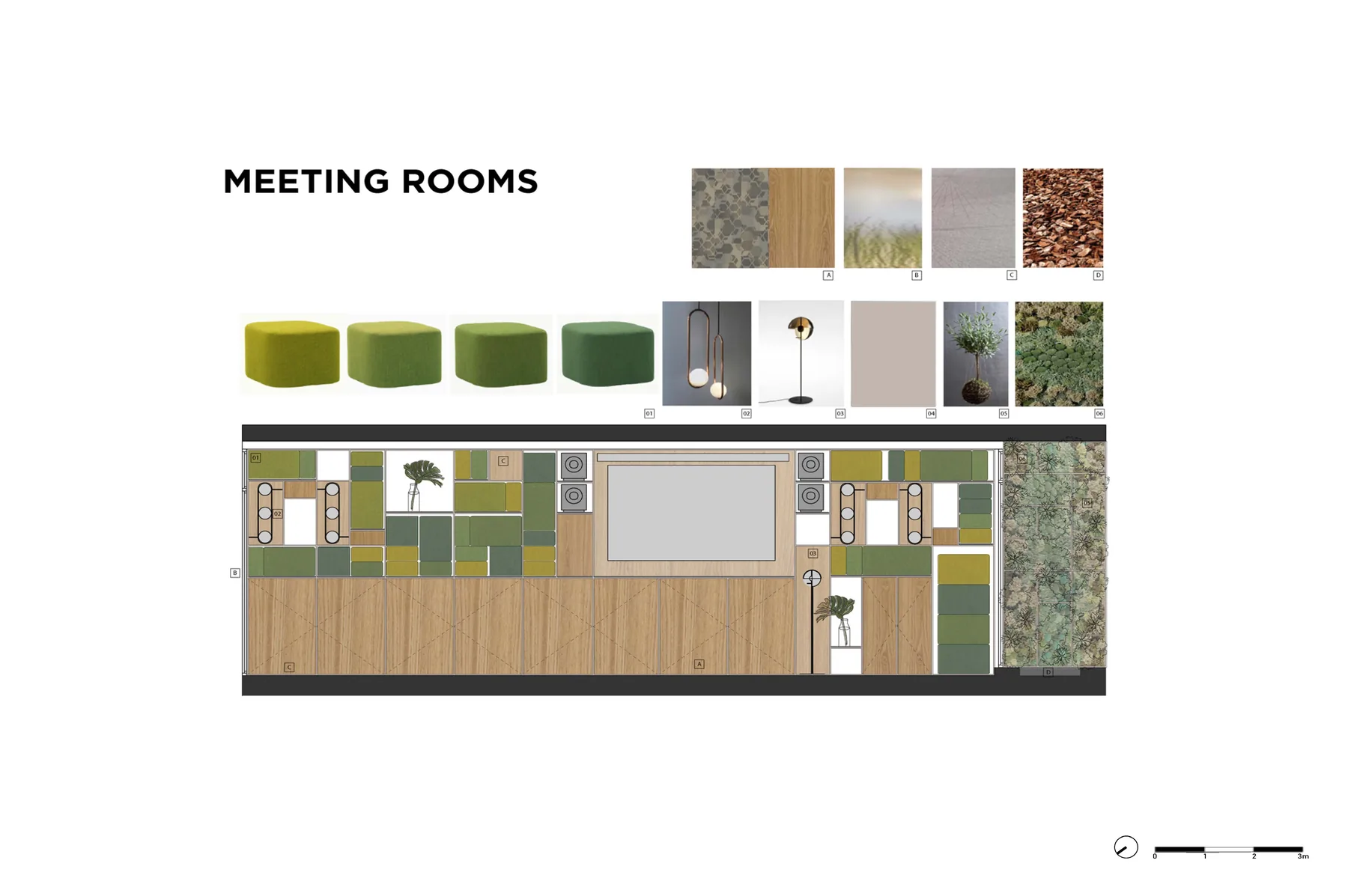
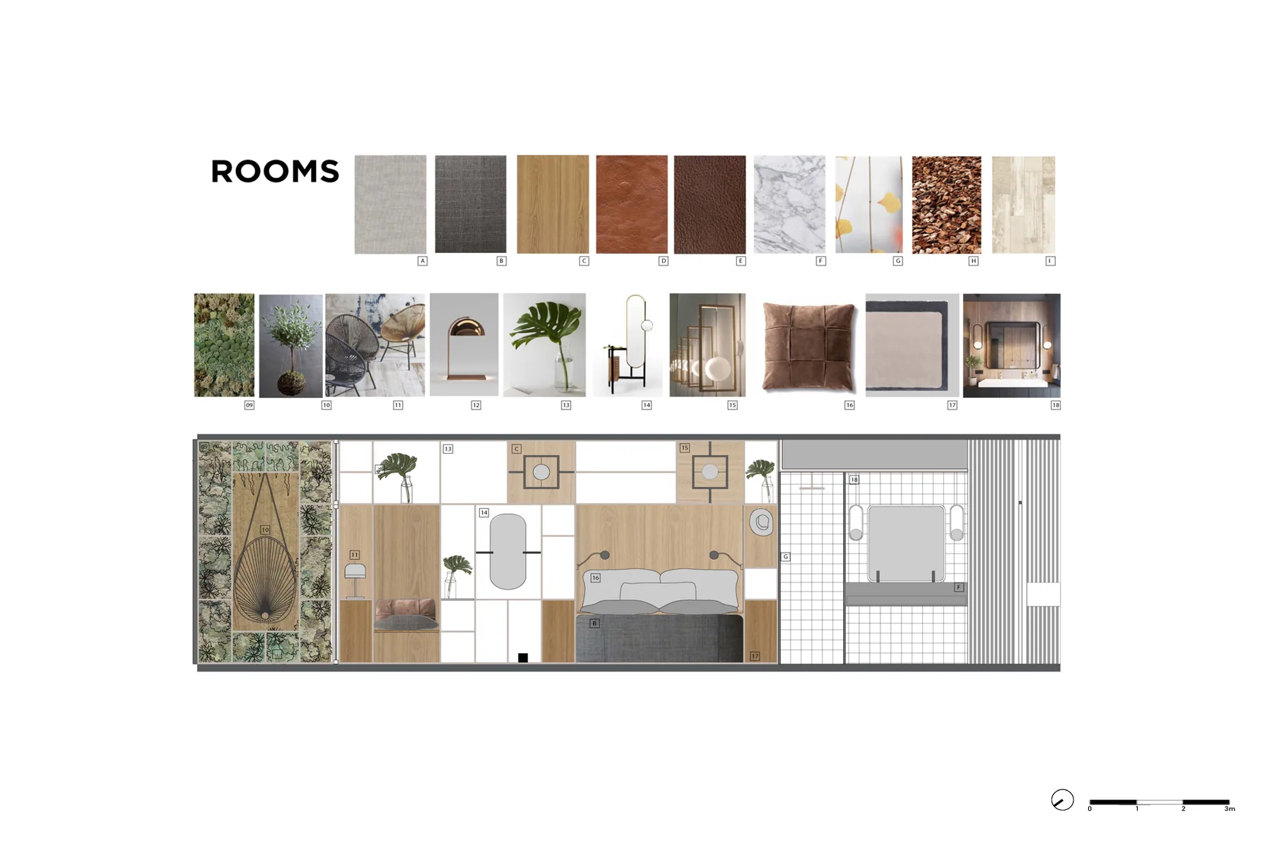
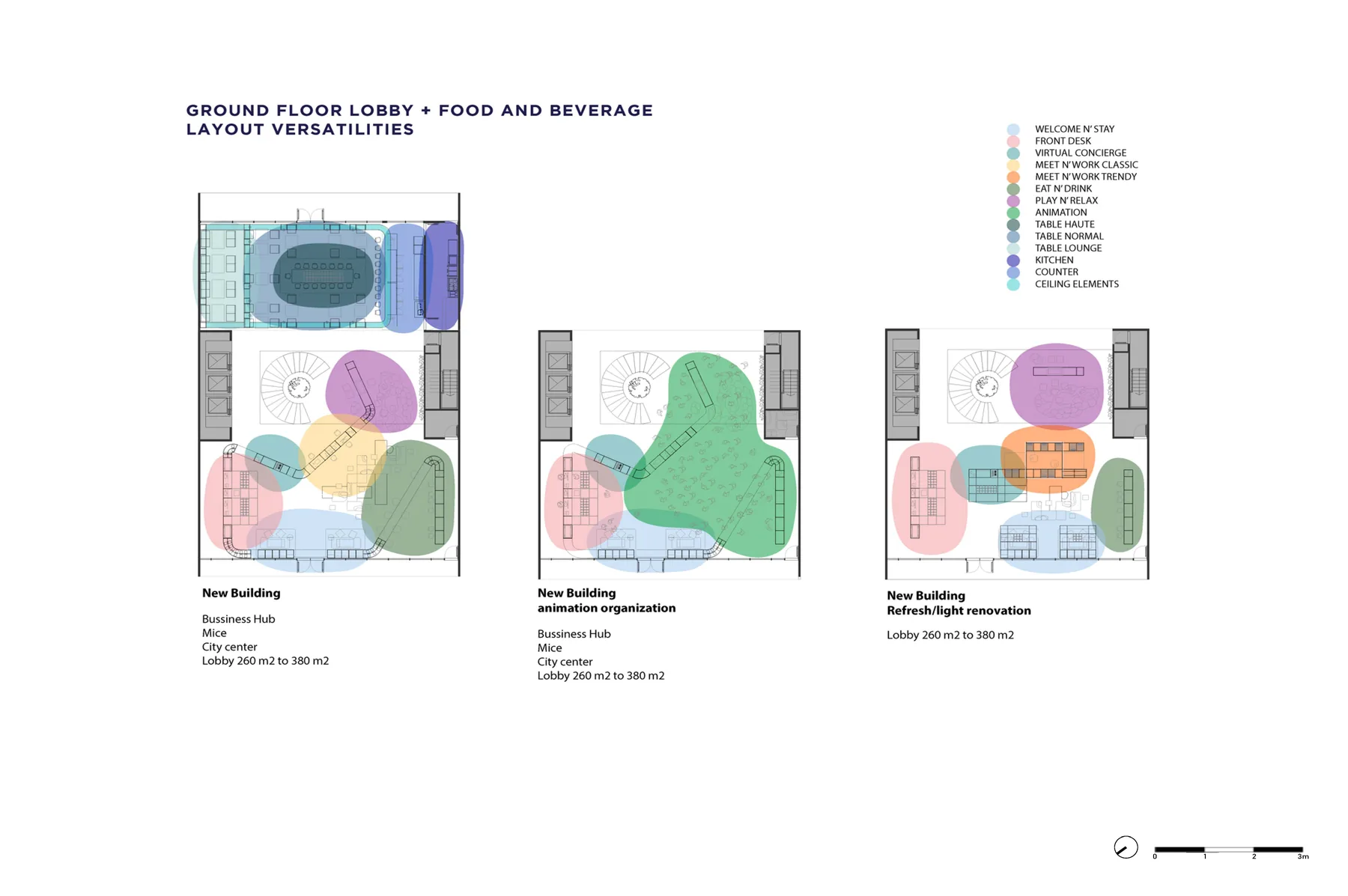
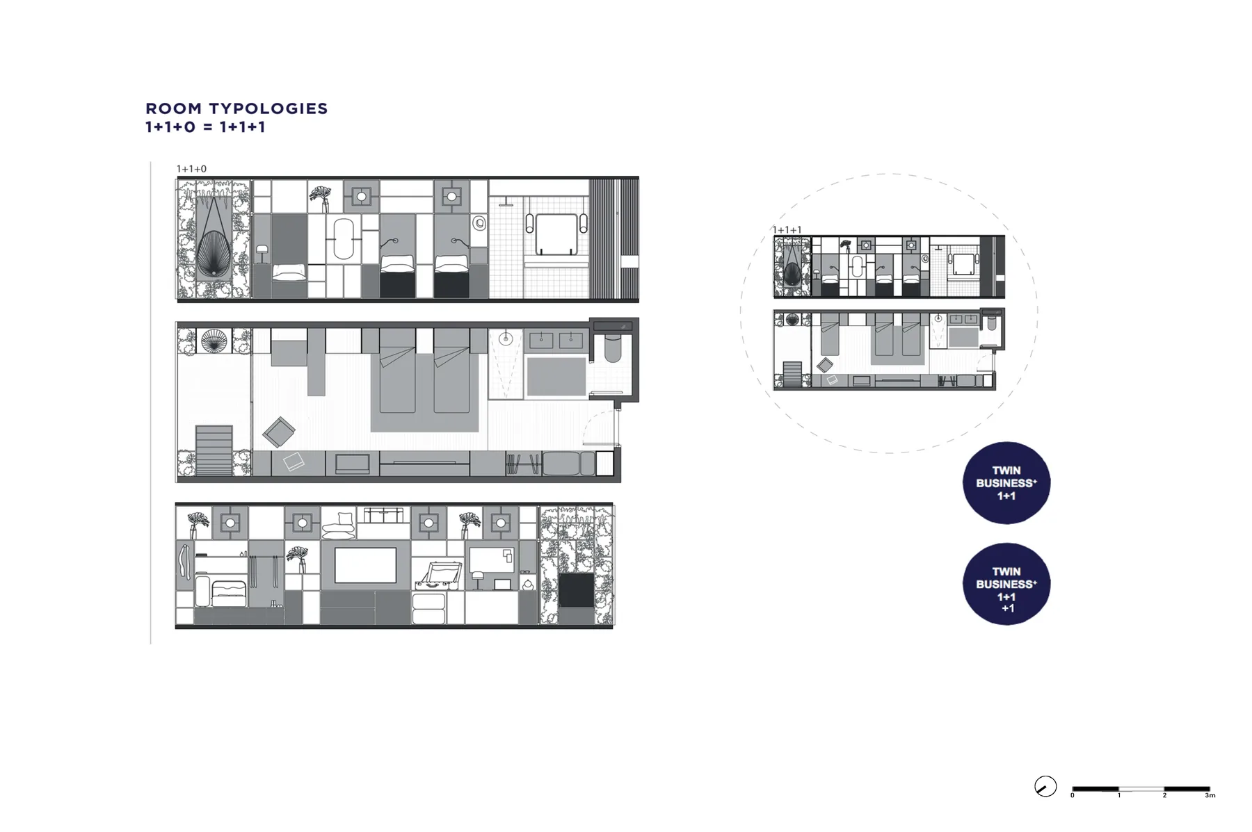
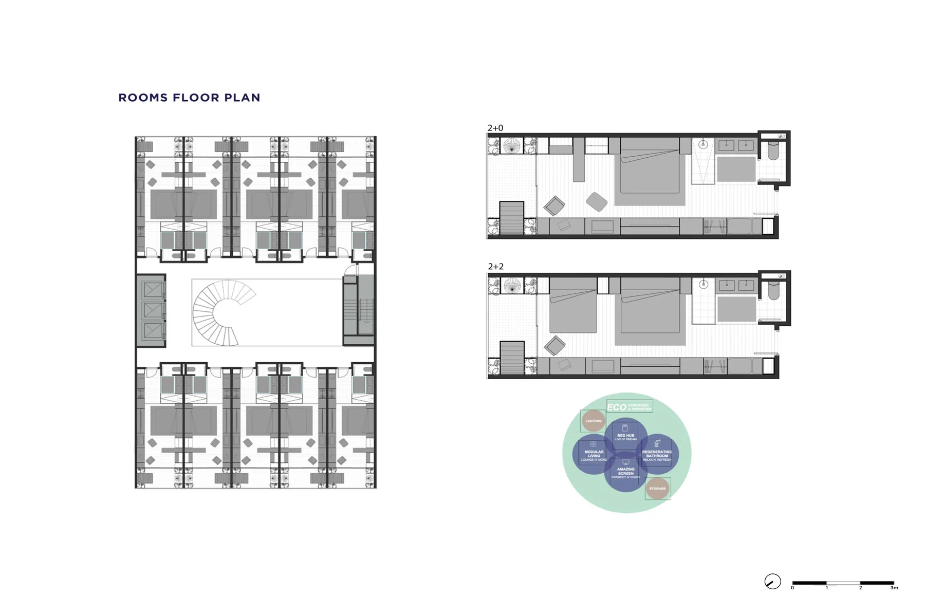
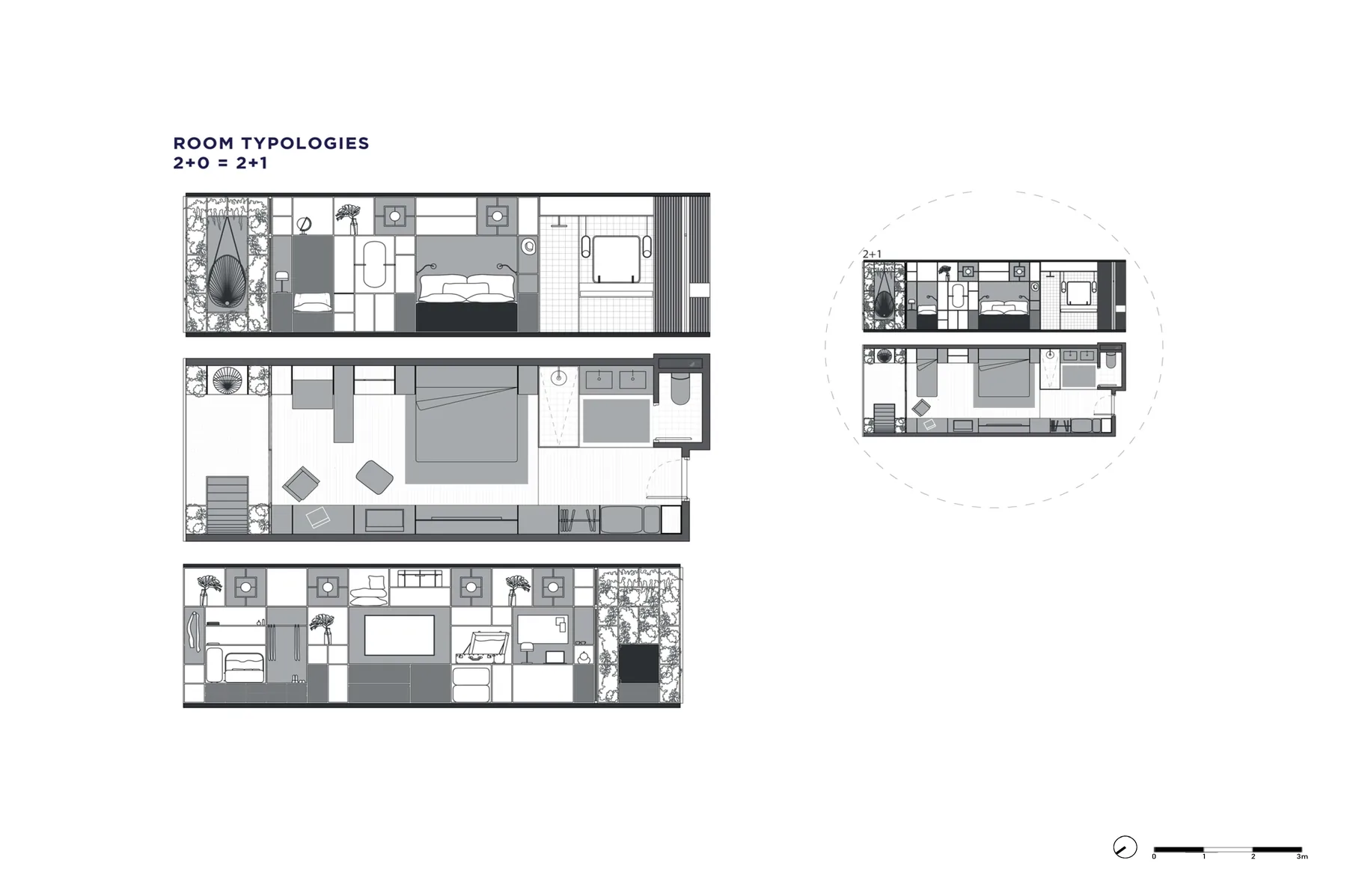
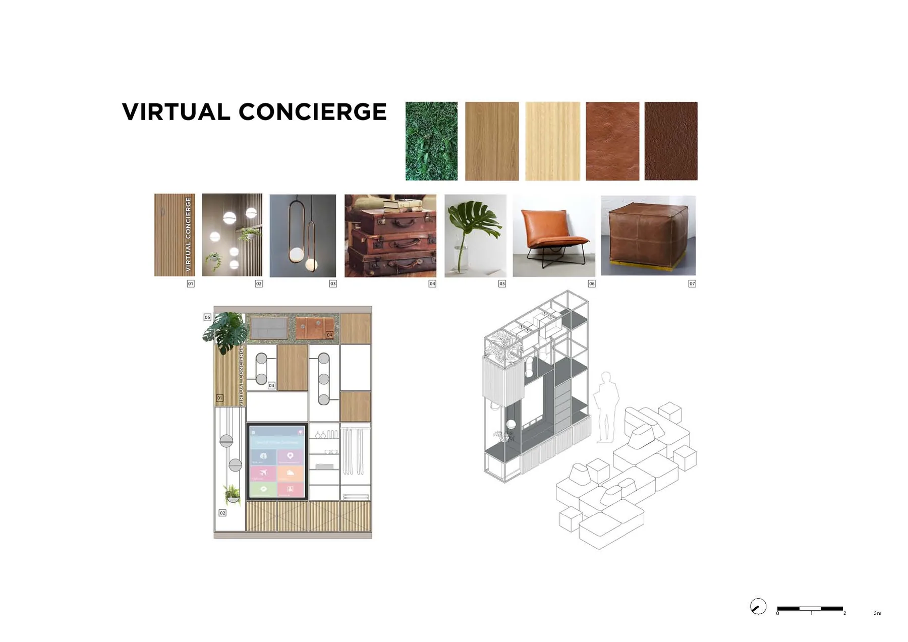
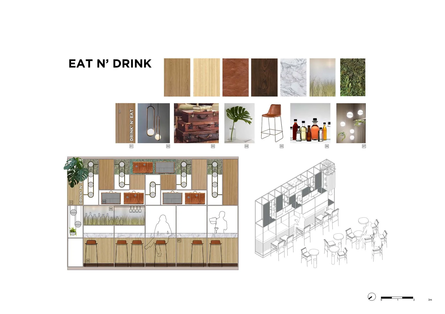
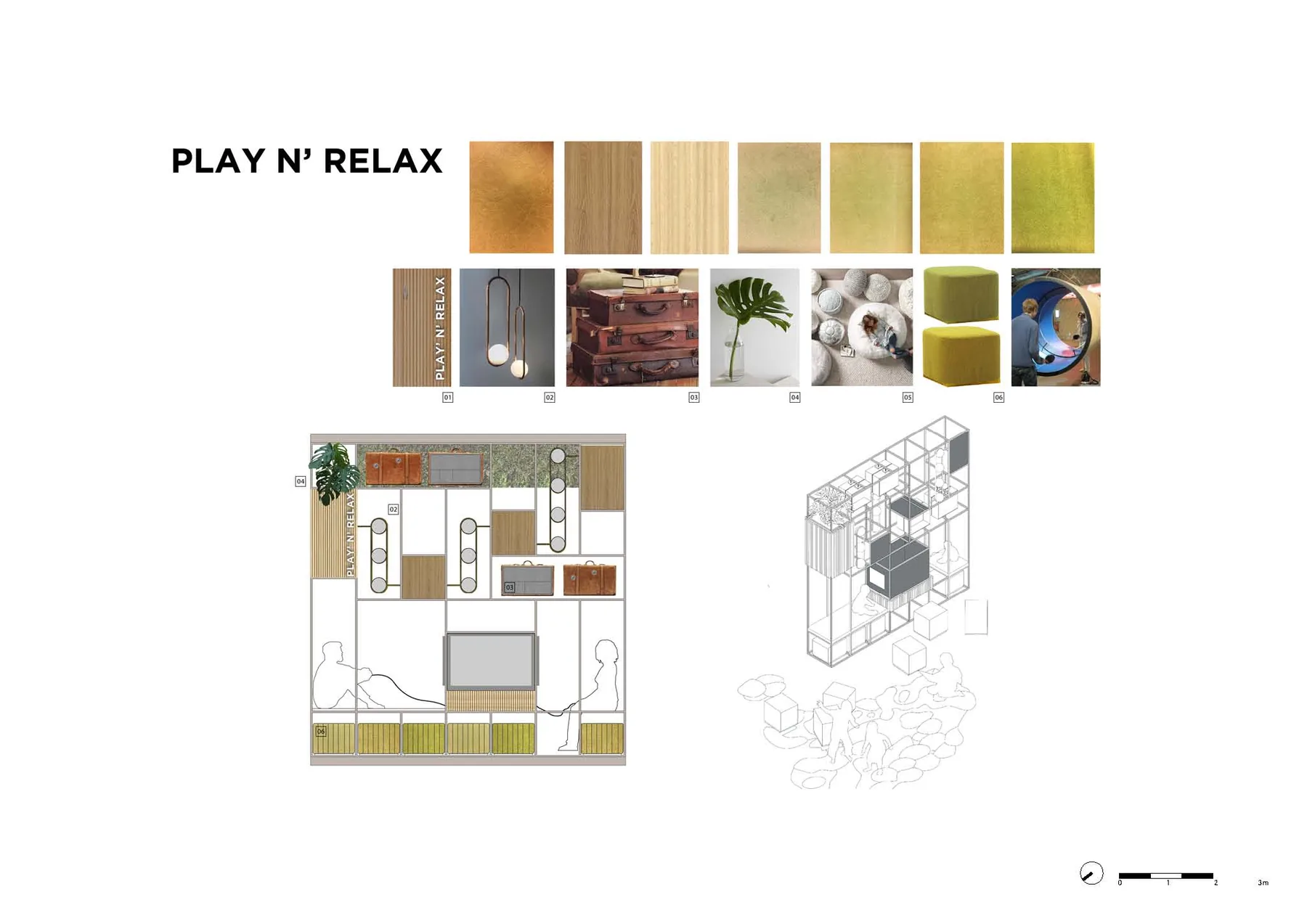
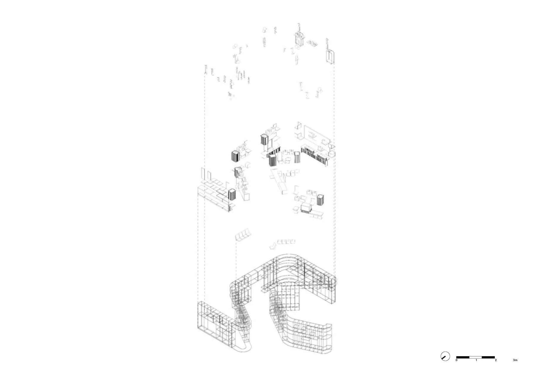
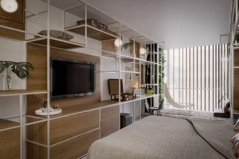
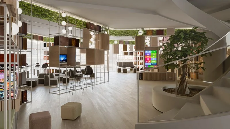
The composition must be consistent with a system that gives it unity. We do not conceive interior architecture as a sum of elements (decorative objects, furniture, lighting). Our proposal is defined by a wide group of pieces that conform a space in itself. This allows multiple possible configurations for use in new hotels or in existing hotels to be renovated.
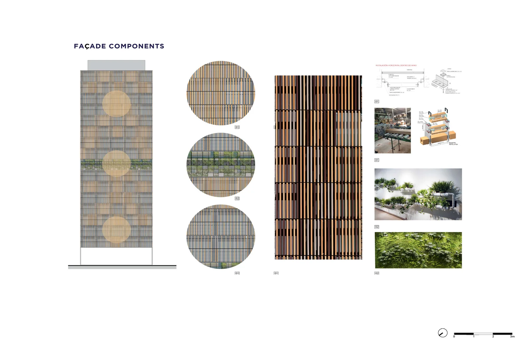
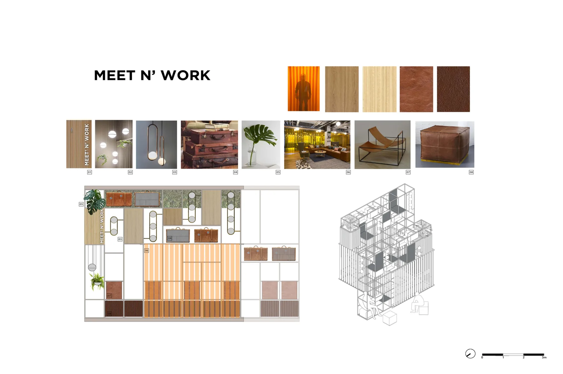
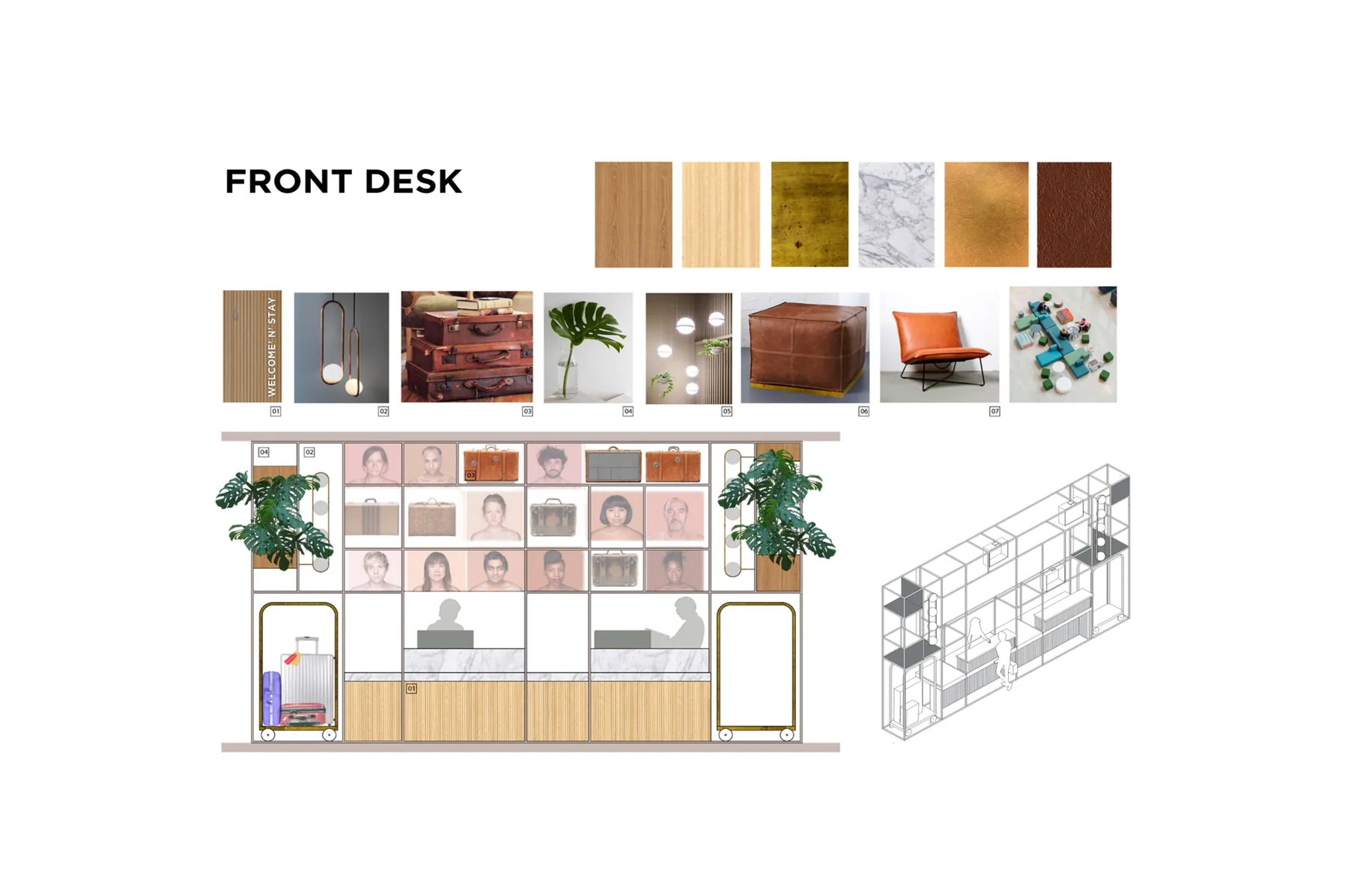
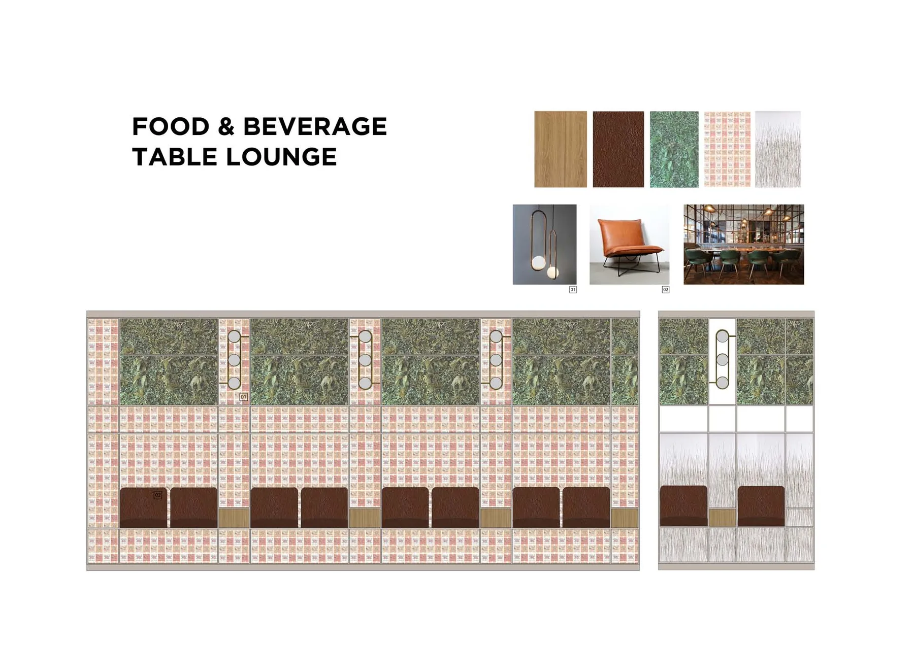
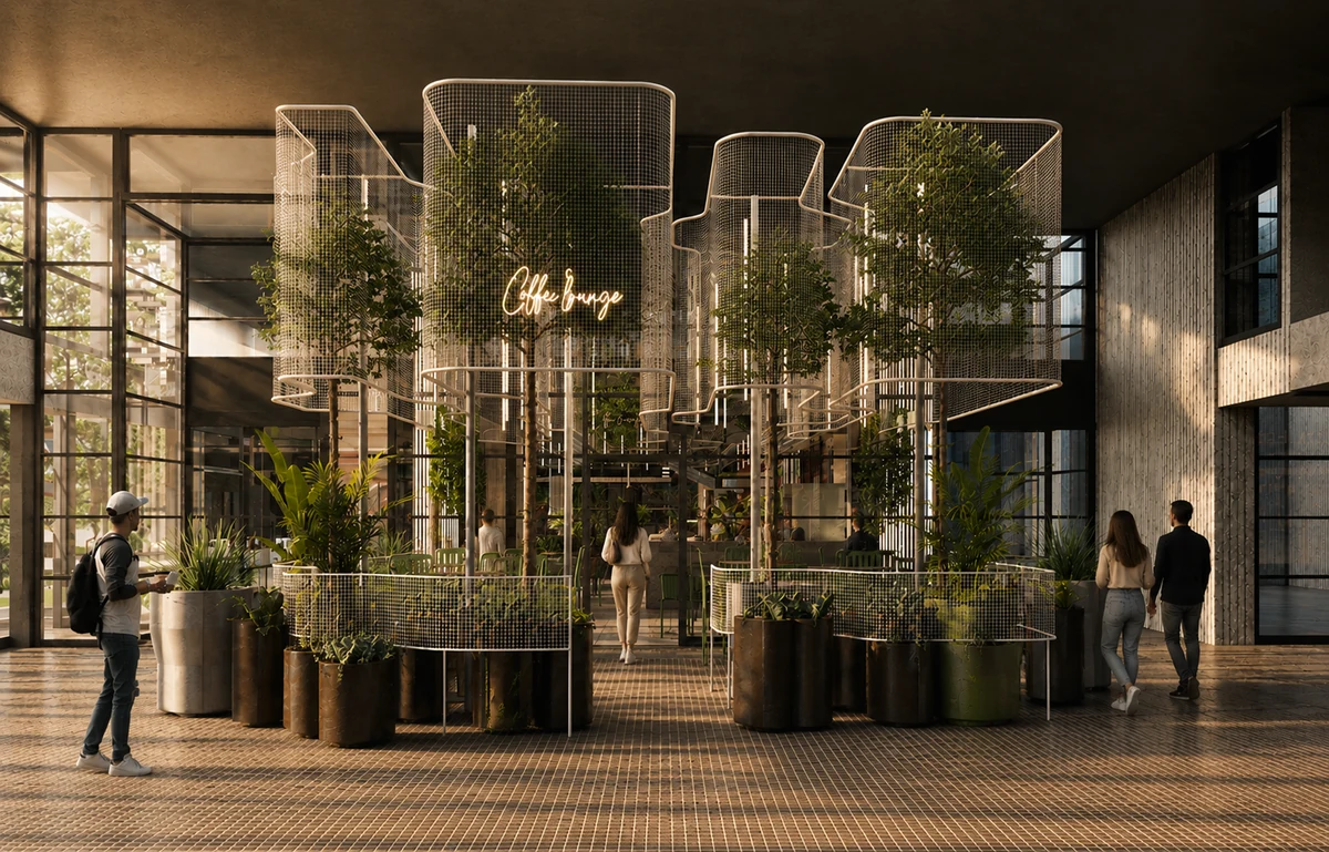
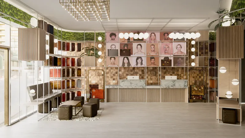
These pieces together constitute a living organism, versatile and adaptable to each key space of the hotel, shaping and organizing everything from the lighting to the fixed and mobile equipment. In addition to its organizational function, it has a symbolic one: to store, through its old suitcases, the personal belongings of every traveller who passes through this hotel. Of those suitcases, their stamps (showing the passage through states and provinces) are part of the local identity captured in a wallpaper. From visual communication we emphasize the collective local identity of the citizens through a huge video wall at the front desk. We also propose the active presence of the most representative local flora. All of this is brought together in a single binding construction system.
It is an emptiness, as such defined by a pure and simple aesthetic. Sterile of imposed aestheticism, although its lines undoubtedly construct a universe associated with that modernity of the stripping away of eclecticism and the ornamental, the status of contemporary man. This dispossession is nowadays called minimalism: life with the minimum and the necessary. Something truly timeless. The minimum calls us to reflection, starting from the conception of life in a minimum and measured, basic, sustainable consumption.
The contemporary traveller knows that a carry-on can hold everything they need. We believe that today, without a doubt, a camera, a laptop to write on, a book to read or a notebook to draw in is more valuable than two suitcases full of clothes. It is these elements that define part of our identity: the value of the emotional over the material. The universal is identity. That aspect that defines us.
Awards and distinctions

Gallery