Cafe Artois

/ Food & beverage

2018

Argentine Polo Field, Buenos Aires.
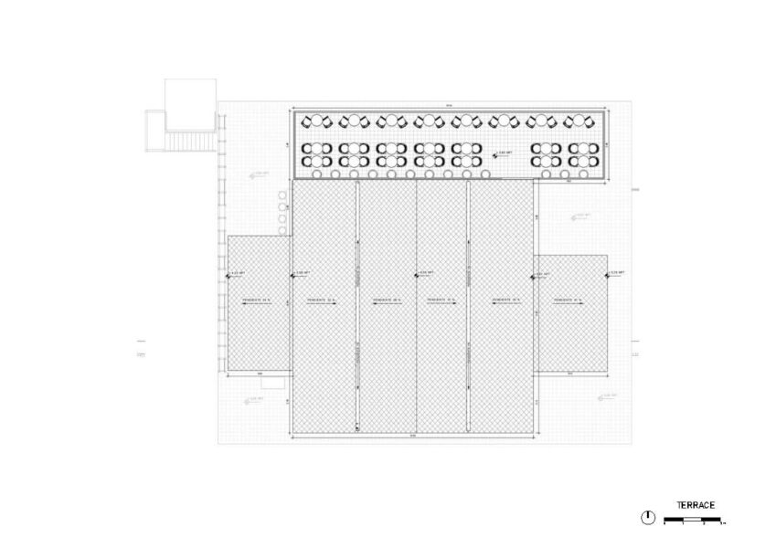
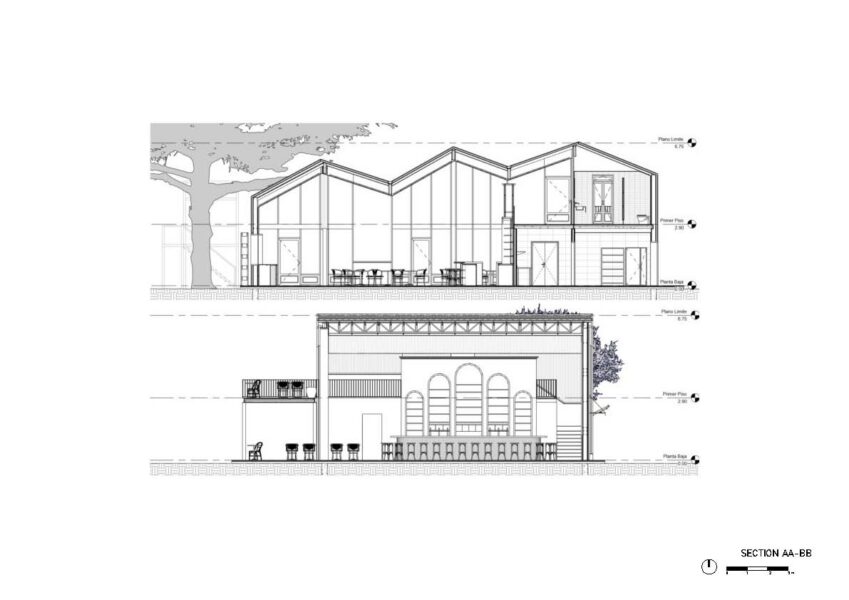
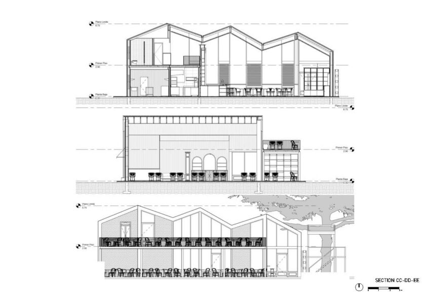
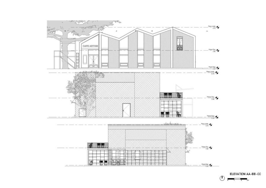
See plans >>
Project Team

Arch. Fernando Hitzig
Arch. Leonardo Militello

Construction documents:
Arch. Gaston Gonzalez Vivo
Arch. Elena Gonzalez
Arch. Federico Vila

Construction management:
Arch. Gaston Gonzalez Vivo

Program

Restaurant & bar

Area

Ground floor covered area 196 sqm
Ground floor uncovered area 56 sqm
First floor covered area 46 sqm
First floor uncovered area 56 sqm

Renders

Arch. Elena González

Services

CD

Concept Design & Art

HM Arquitectos

SD

Schematic design

HM Arquitectos

CD

Construction documents

HM Arquitectos

Abstract

The project is located in an exclusive area of the city of Buenos Aires, within the area of the most important polo field in South America.

The project is the result of a two-factor investigation in related to the company that called us to the Stella Artois project, which we will describe as follows.

On the one hand, the building volume made us interested in refering it to the medieval constructive silhouettes that define the typical skyline of Bruges, which is very typical of Belgium, the country where the brand was born.

On the other hand, the interior work had to refer to the concept of the old typical European coffees of the beginning of the 20th century, very related to the Parisians style.

The challenge was to compose a volume inspired by these old buildings and their characteristic Belgian ceilings, but executing the figure under a contemporary vision, that is, modifying the slopes of the ceiling generating a dynamism and avoiding a regular volume generating a dynamism and avoiding a regular volume. It looks like the image of the typical buildings in front of the Dijver canal or the Bruges market.
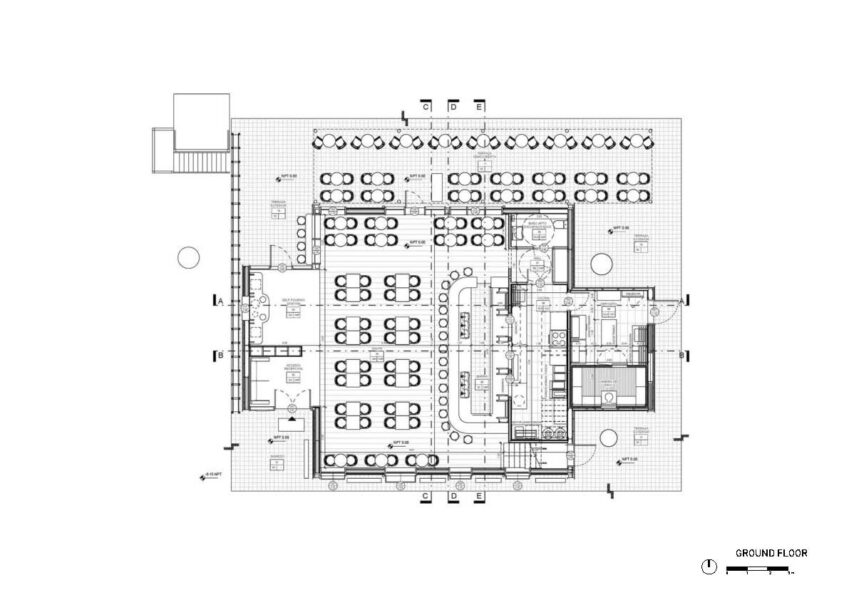
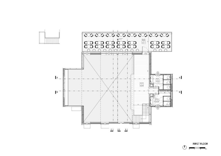
The configuration of these ceilings forced us to understand that the windows had to dialogue in a contemporary way with that dynamism. On the other hand, in front of the building is located the polo field, and in the background the skyline of the city of Buenos Aires. The impact of these visuals was decisive in defining the dimension of the openings.

Constructively, we set up ornamented circular columns under the sloped ceilings, managing to mix an eclectic composition.

The interior organization is a typical two-level restaurant and all the visuals are directed to the polo field, hiding the services to the opposite sector.

The complex dialogue between an interior mostly represented under an image of a café of the early twentieth century, and the exterior of contemporary configuration, resulted in a complex eclectic balance of languages. This made it possible for our client to accept a contemporary image in spite of its clear inclination towards an old aesthetic.