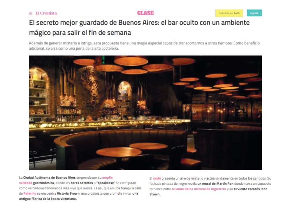
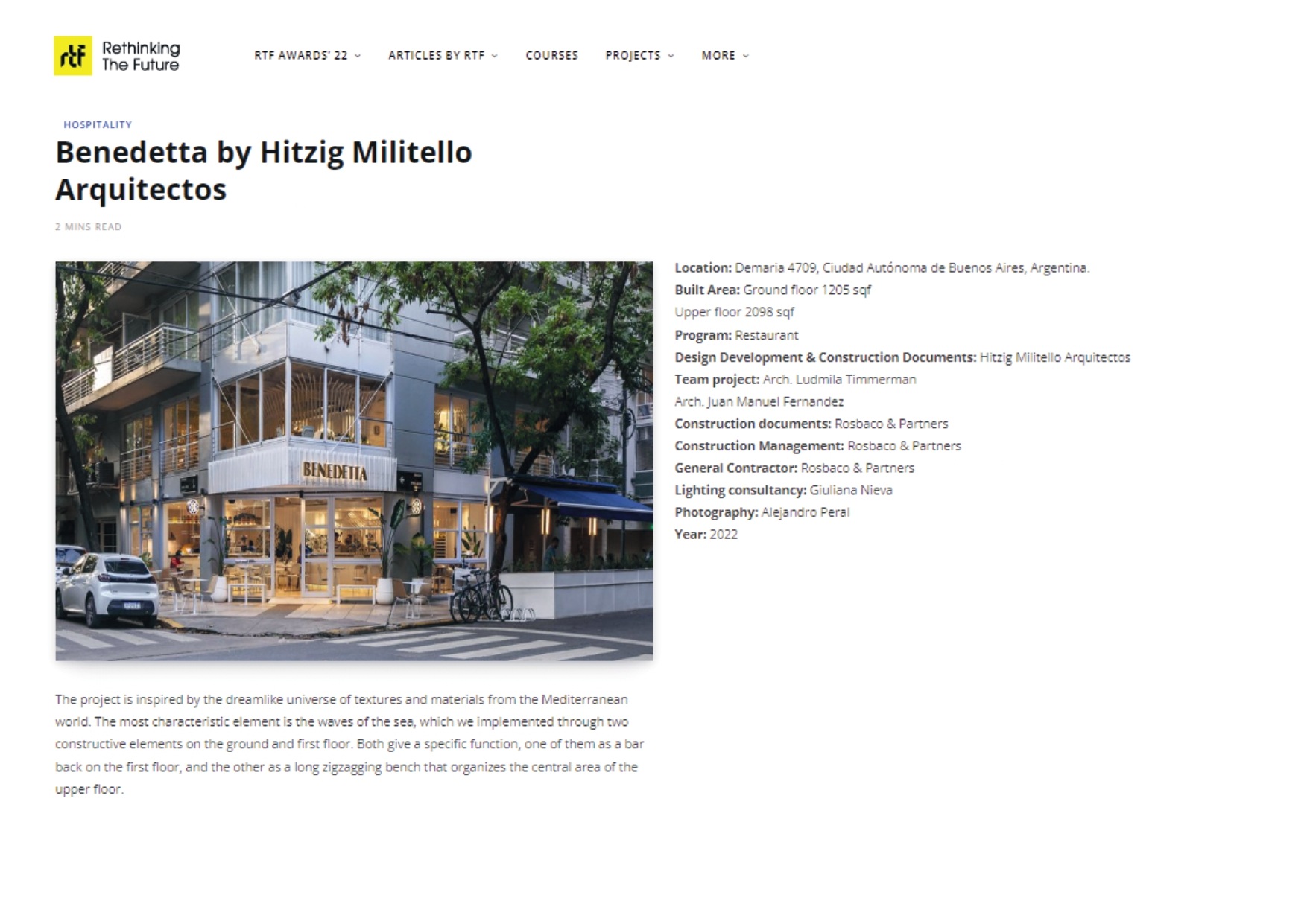
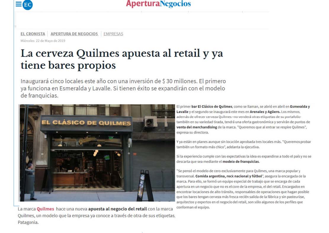
Services
CD
Concept Design & Art
HMA Arquitectos
DD
Design developments
HMA Arquitectos
CD
Construction documents
HMA Arquitectos
CA
Construction administration
HMA Arquitectos
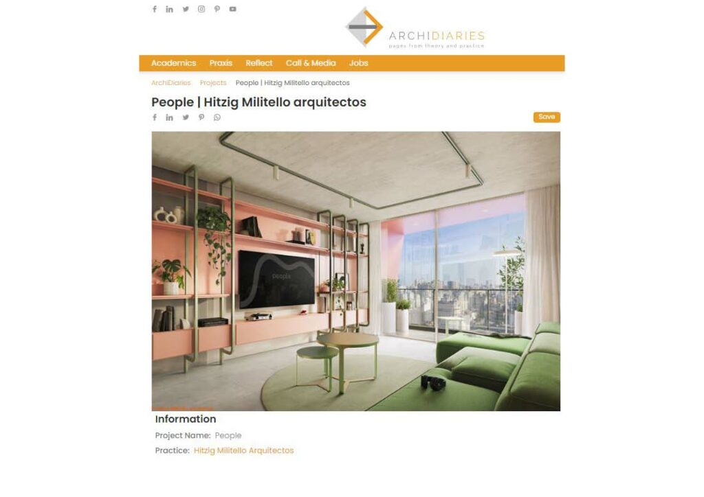
ID
Interior design
HMA Arquitectos
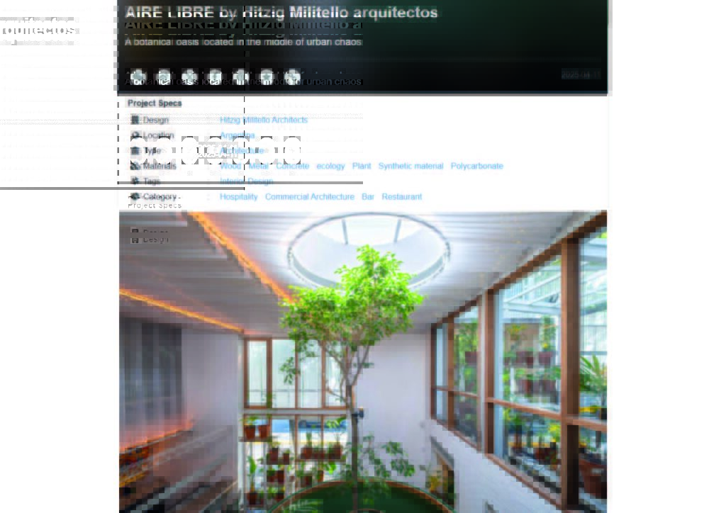
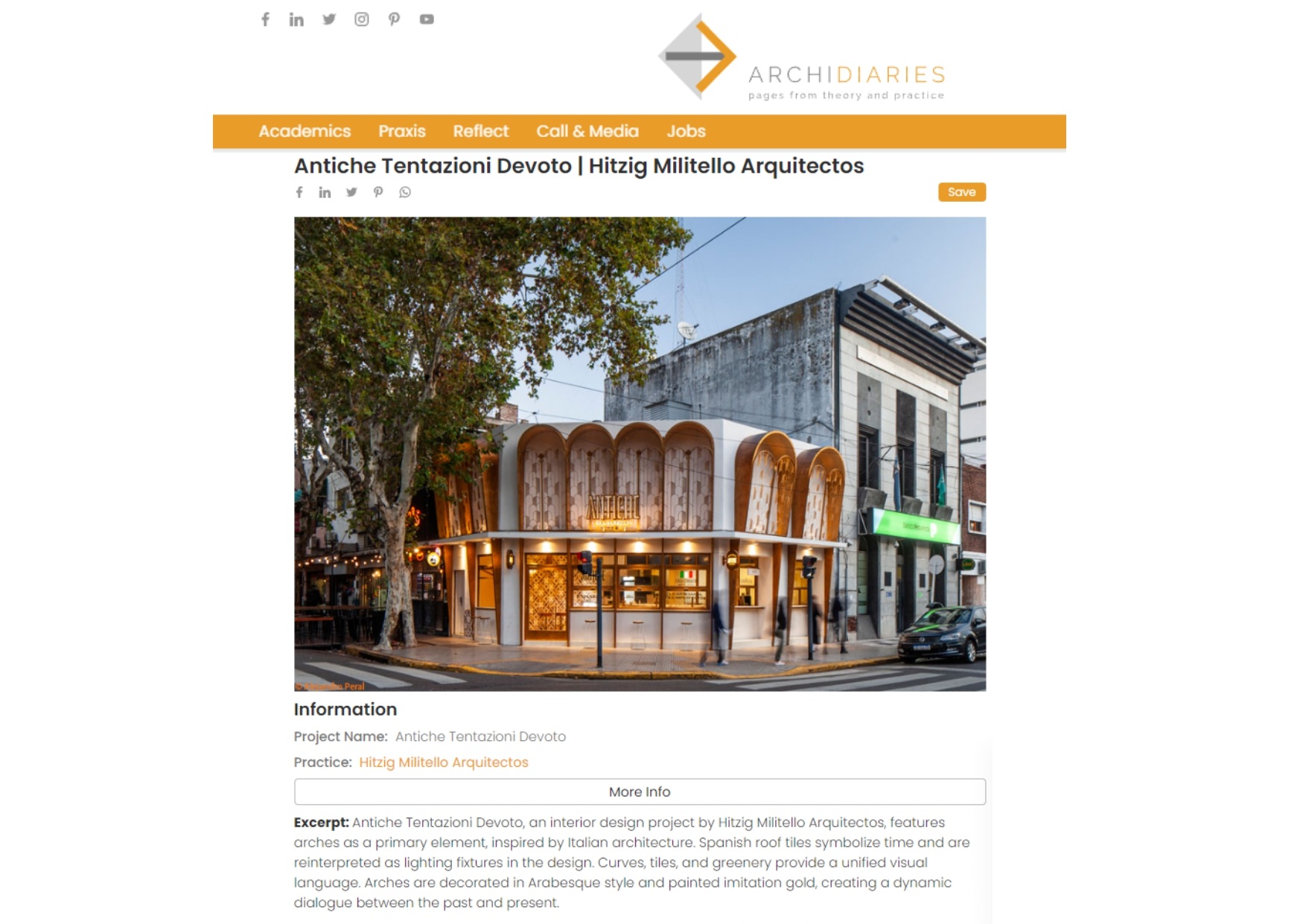
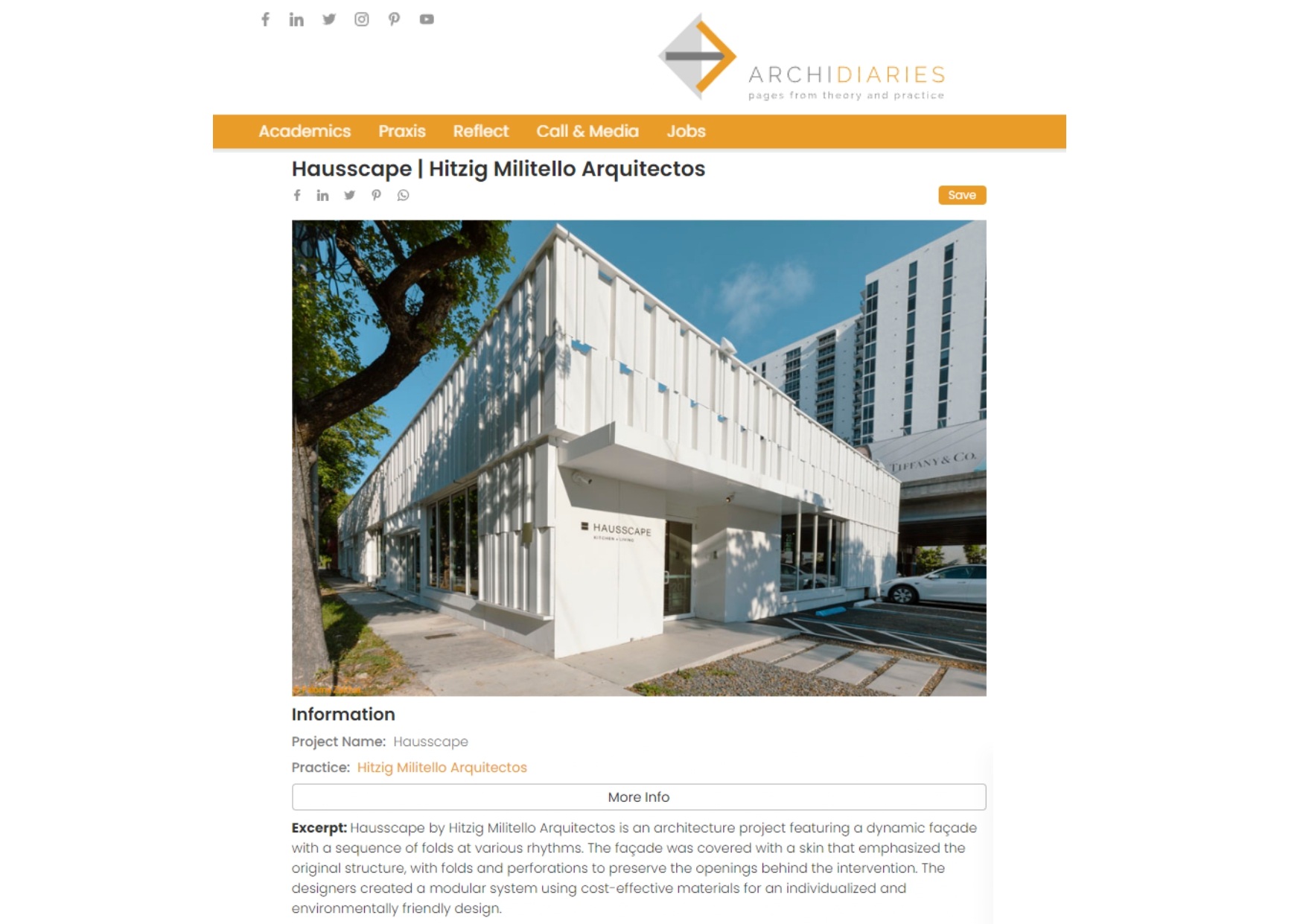
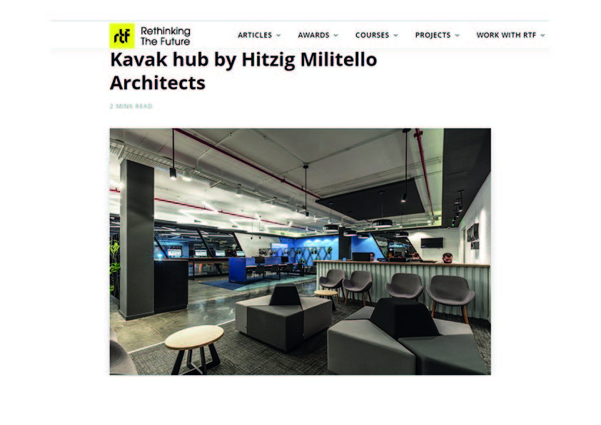
Abstract
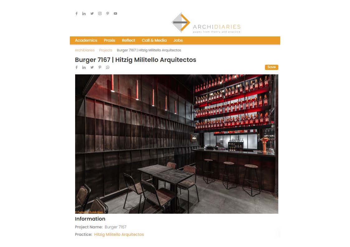
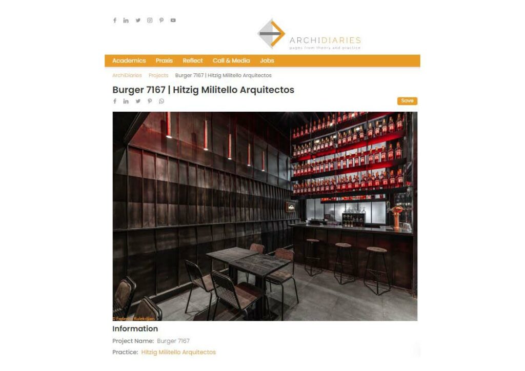
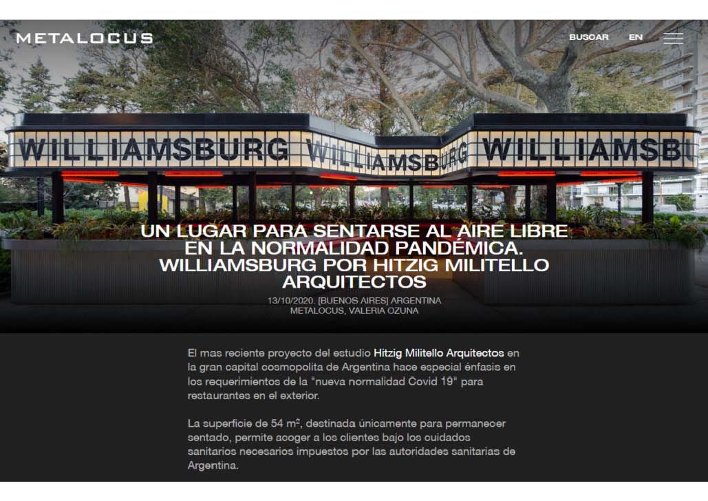
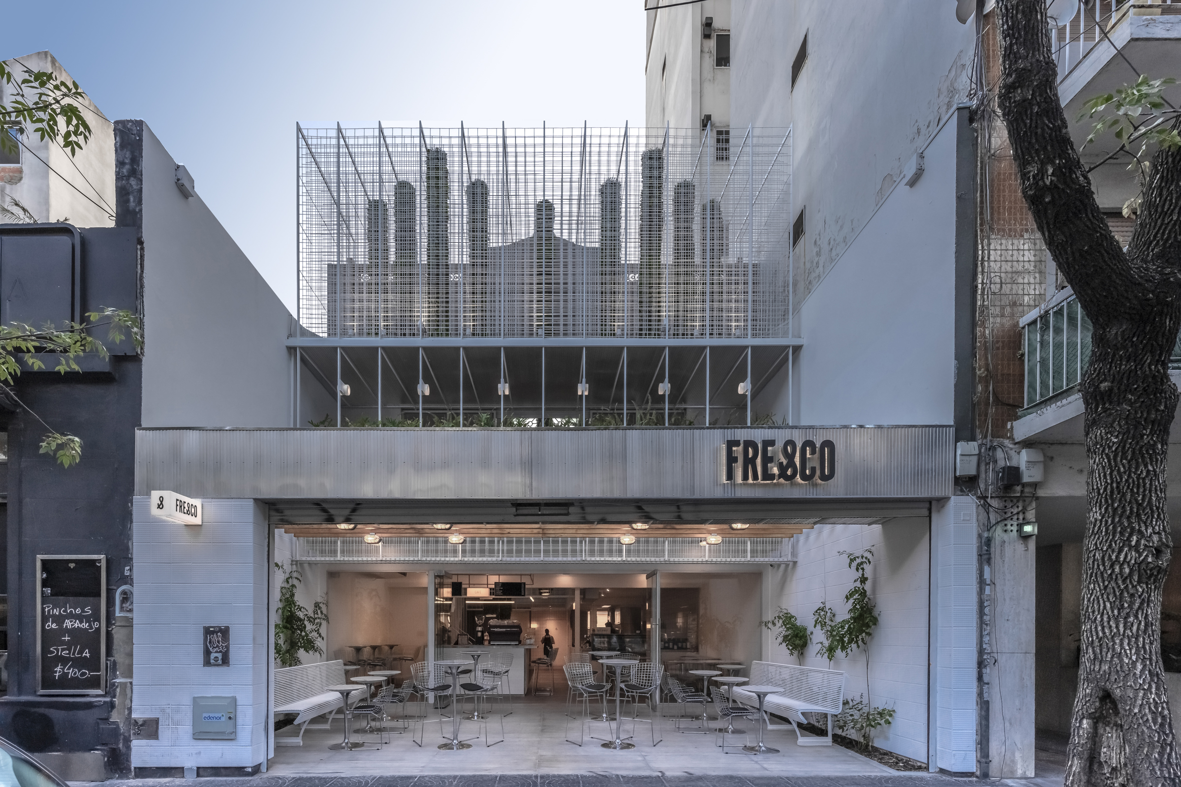
This commission has been very particular given the specific characteristics of the site and the particular contextual situation of COVID 19.
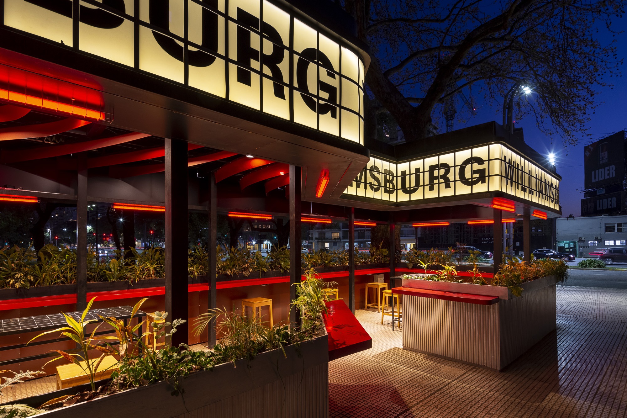
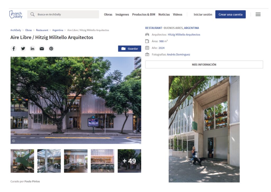
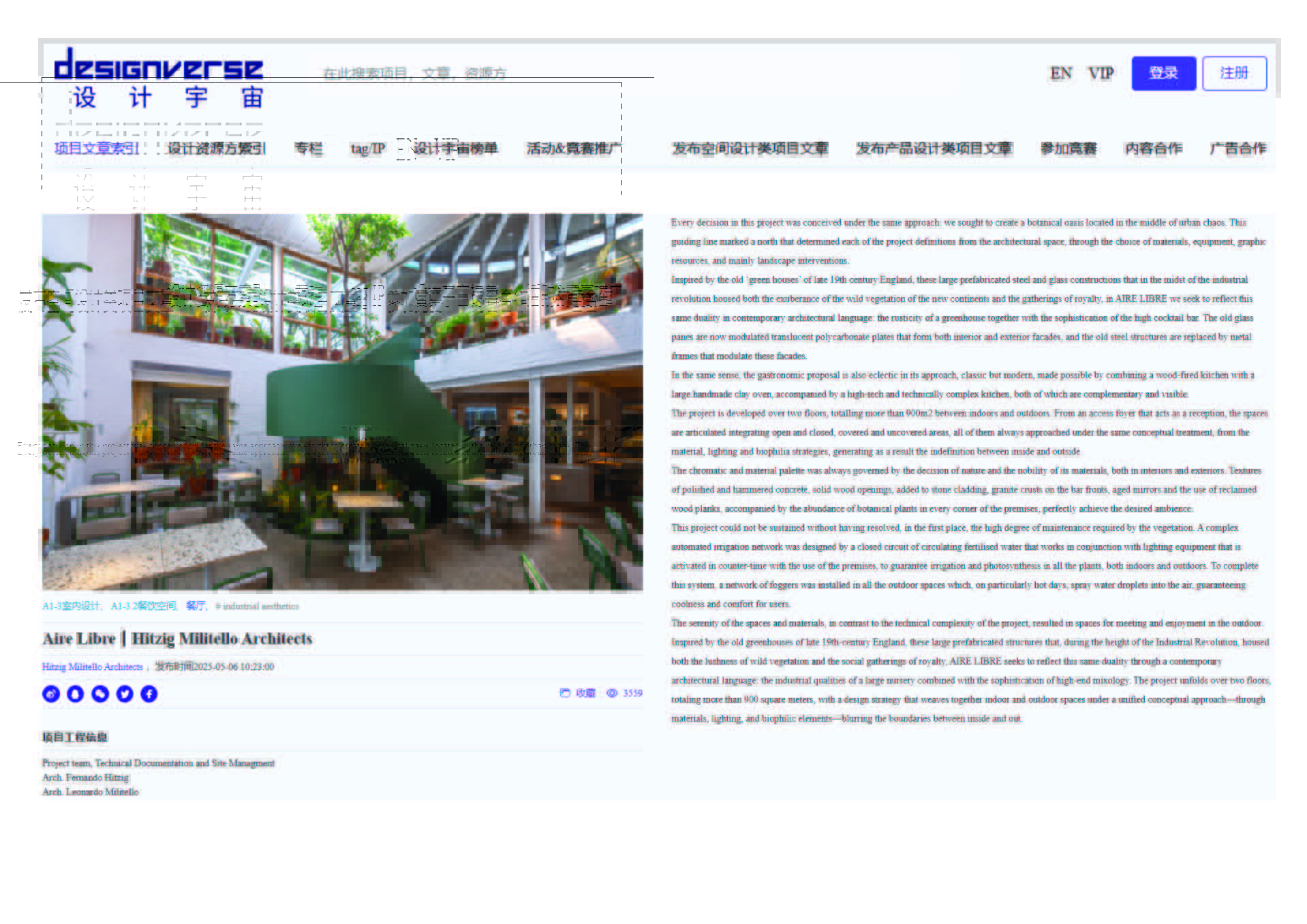
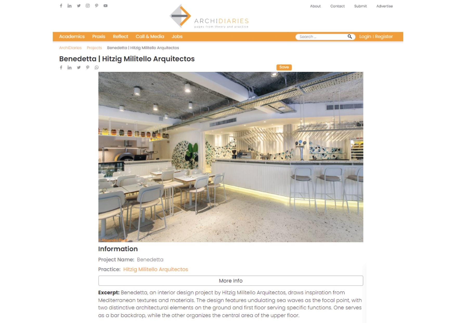
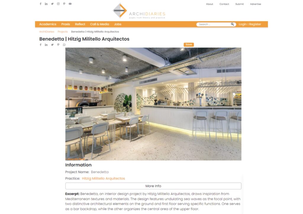
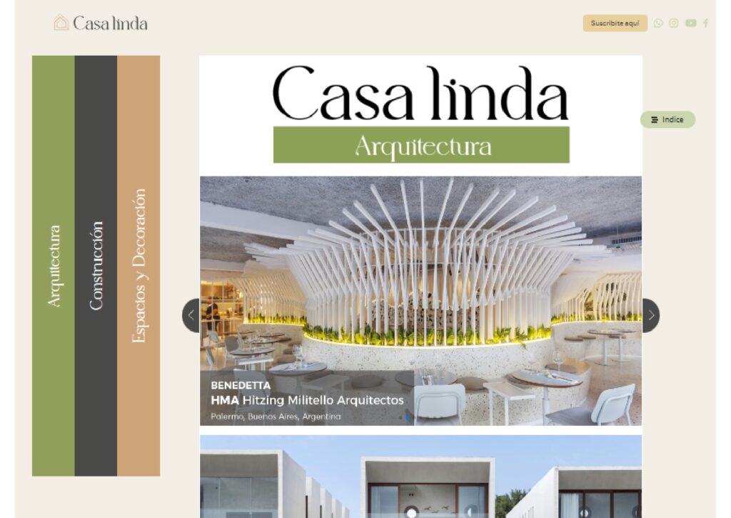
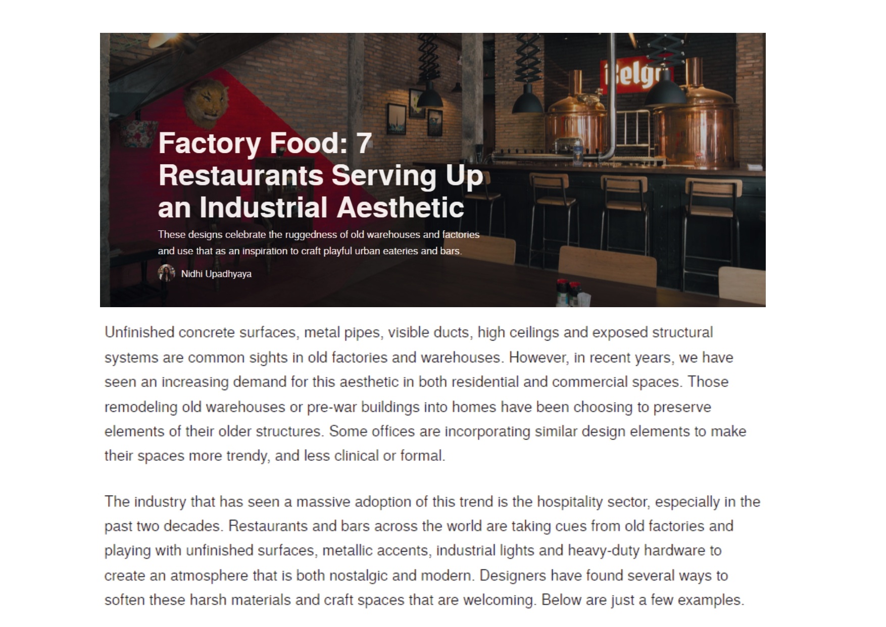
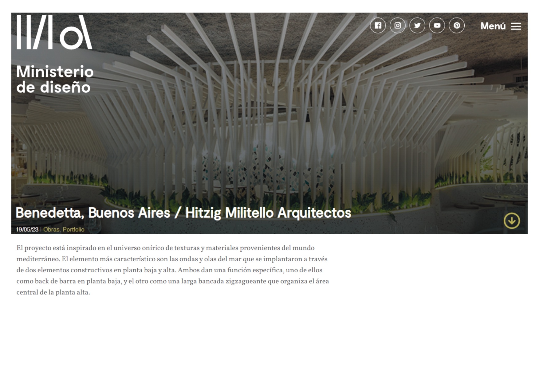
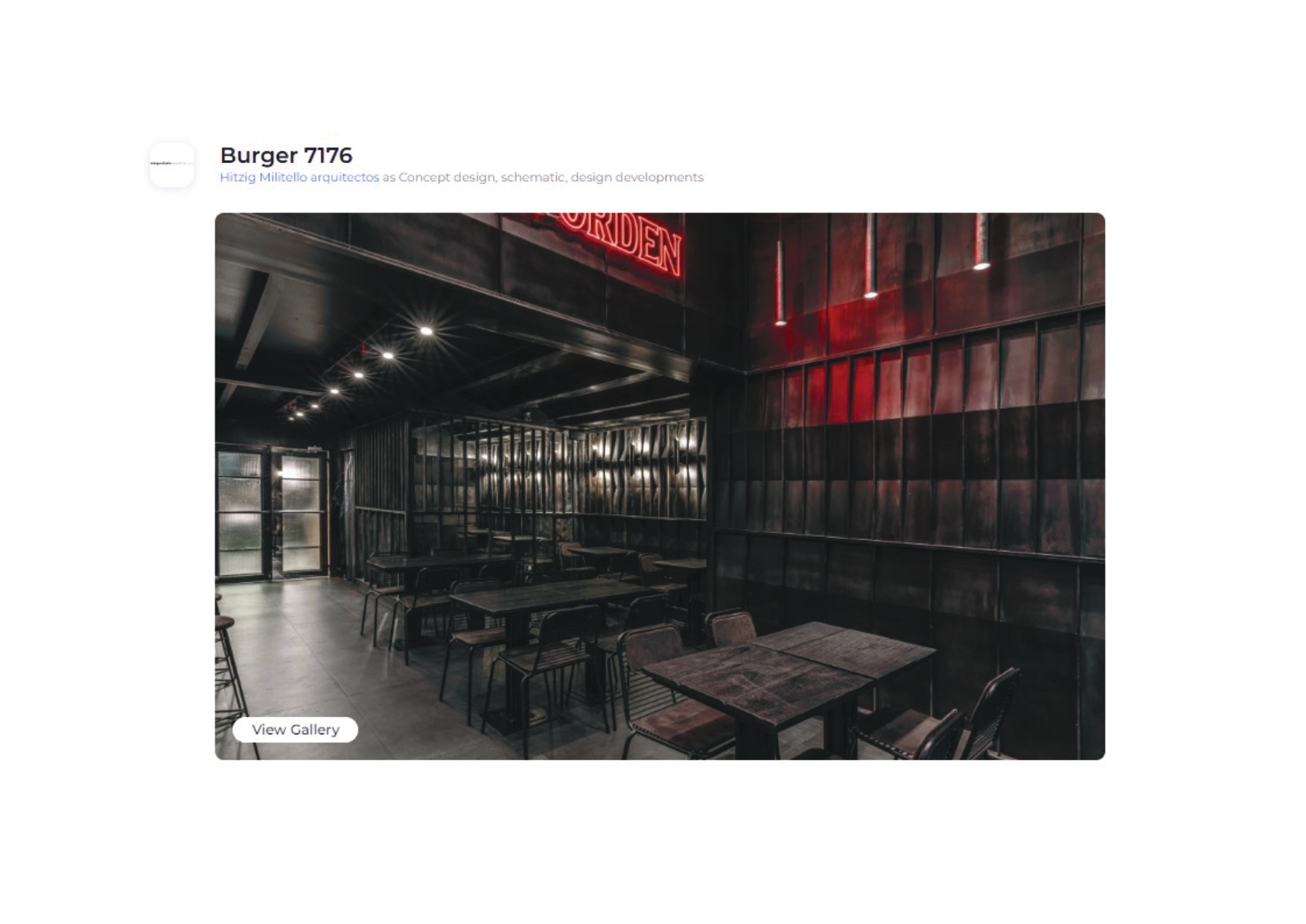
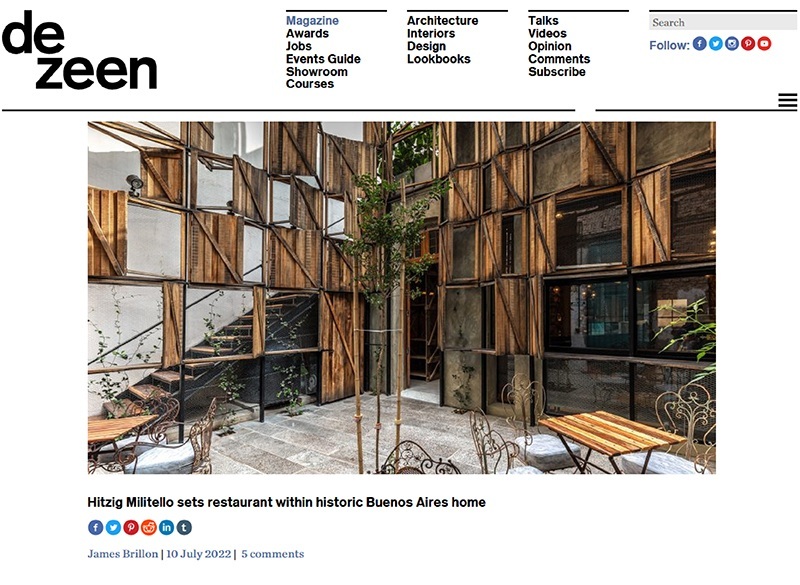
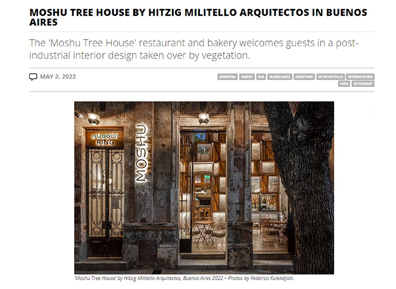
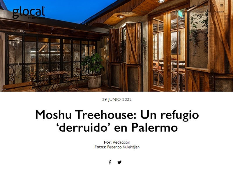
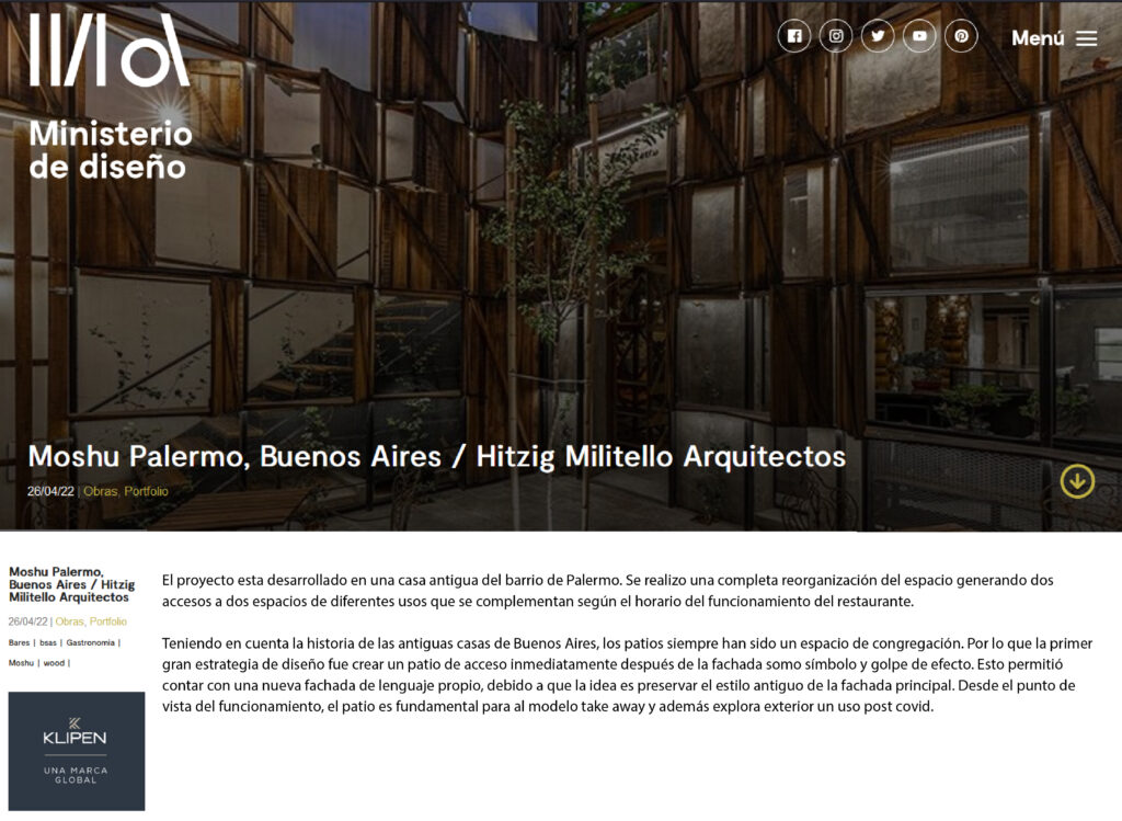
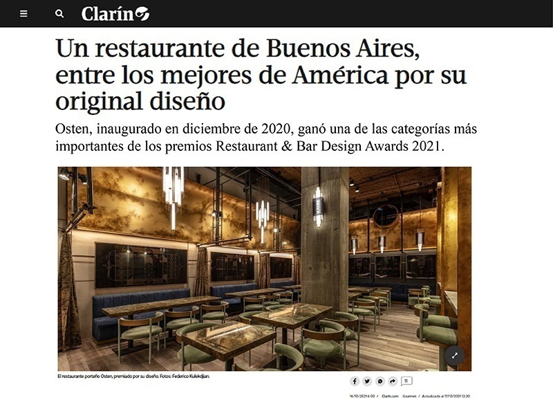
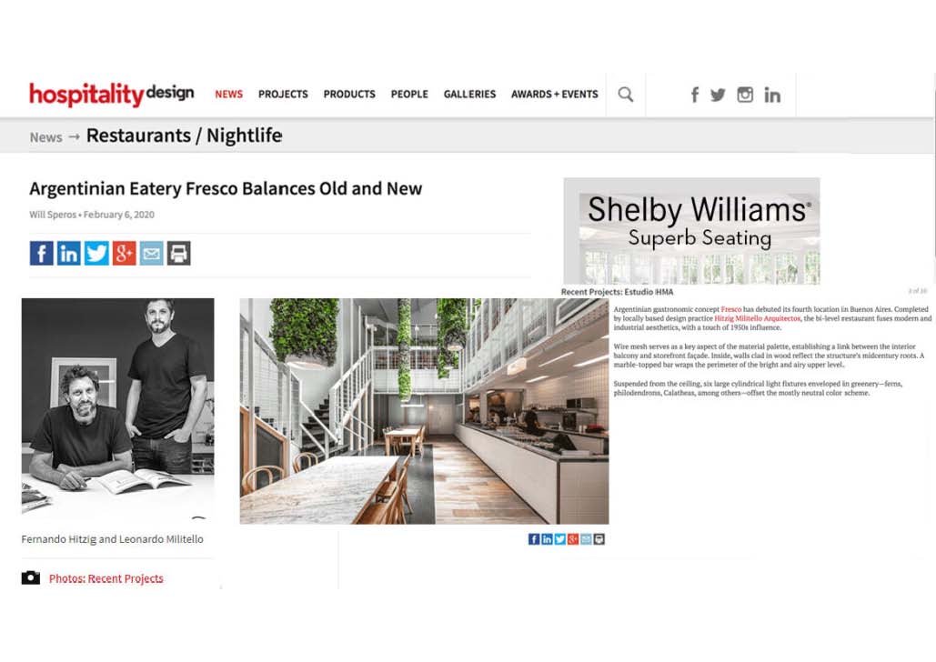
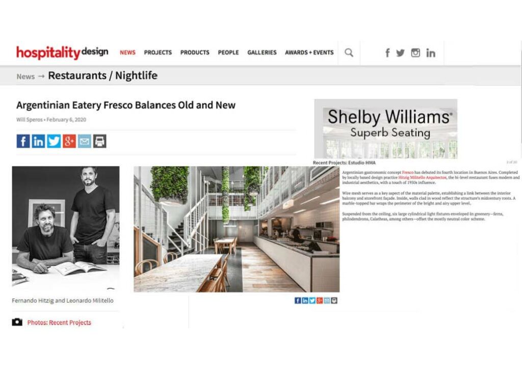
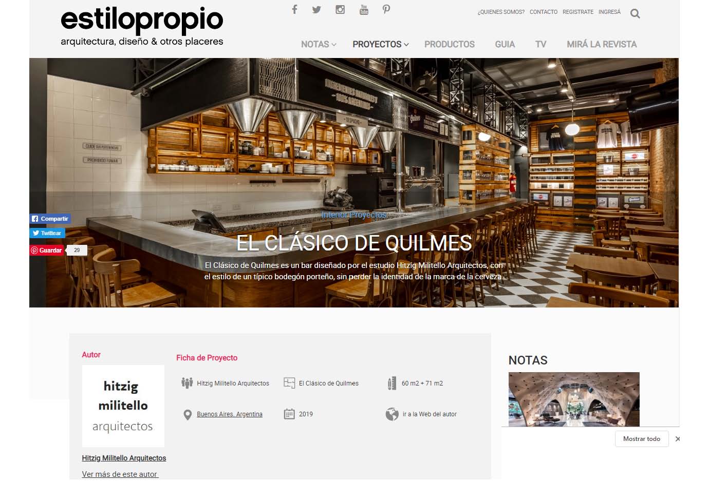
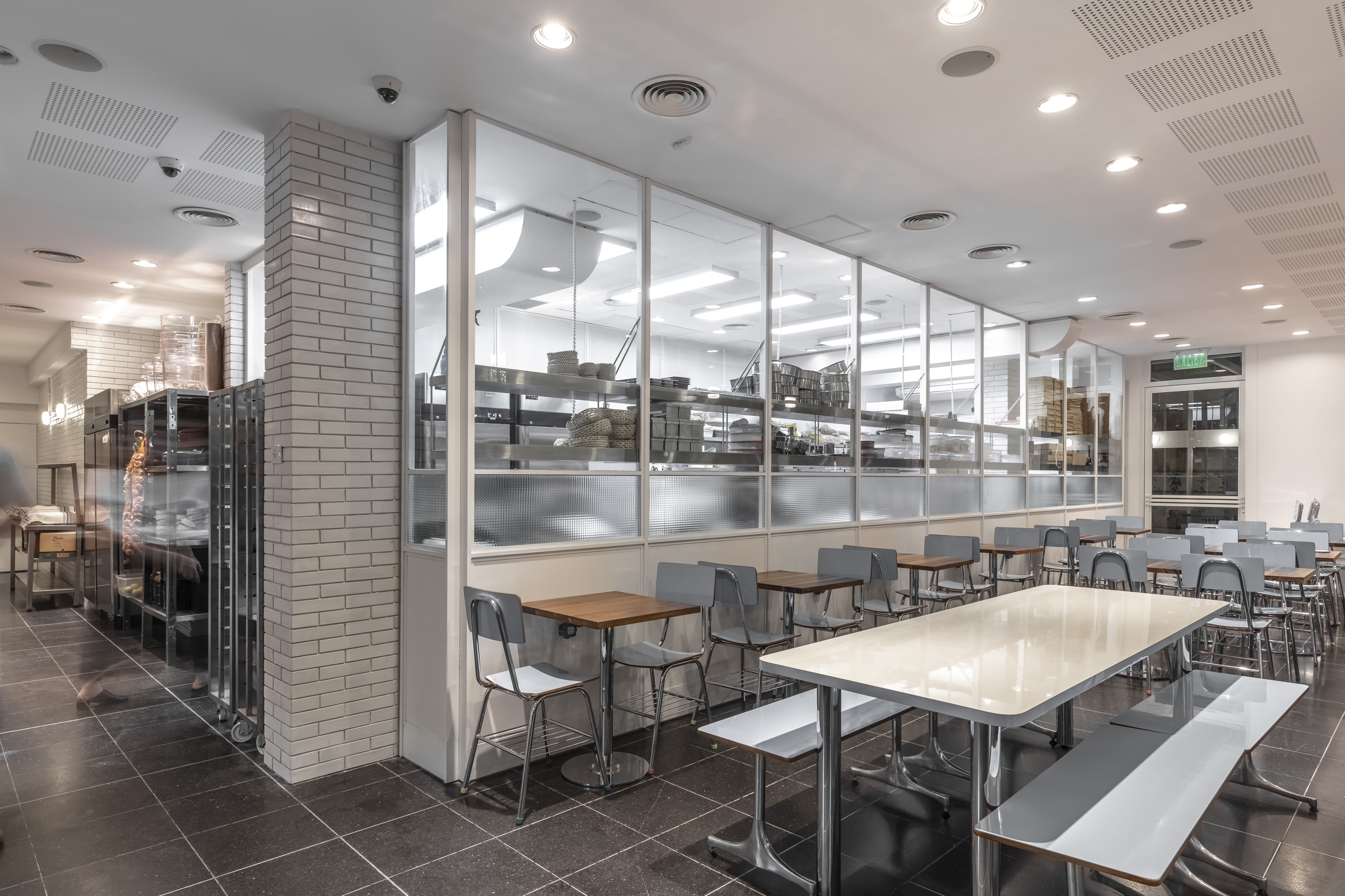
The structure serves as an adjacent, supporting space to the existing restaurant venue, which is situated under a railway construction of the 20th century. However, the fully exterior space has resolved both aesthetic and constructive qualities, as if it were autonomous.
The design generates two asymmetrical façades, with one of them opening towards the street and the shops. in this way, the venue invites passers-by to stop and enjoy a meal in the dining area.
This area of 54 m2 of only sitting allows to host guests under the necessary health care imposed by the health authorities.
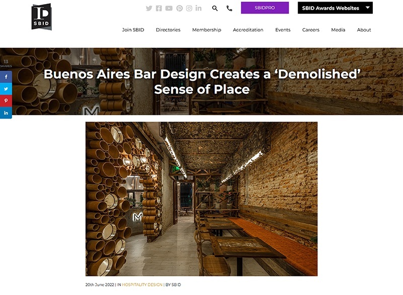
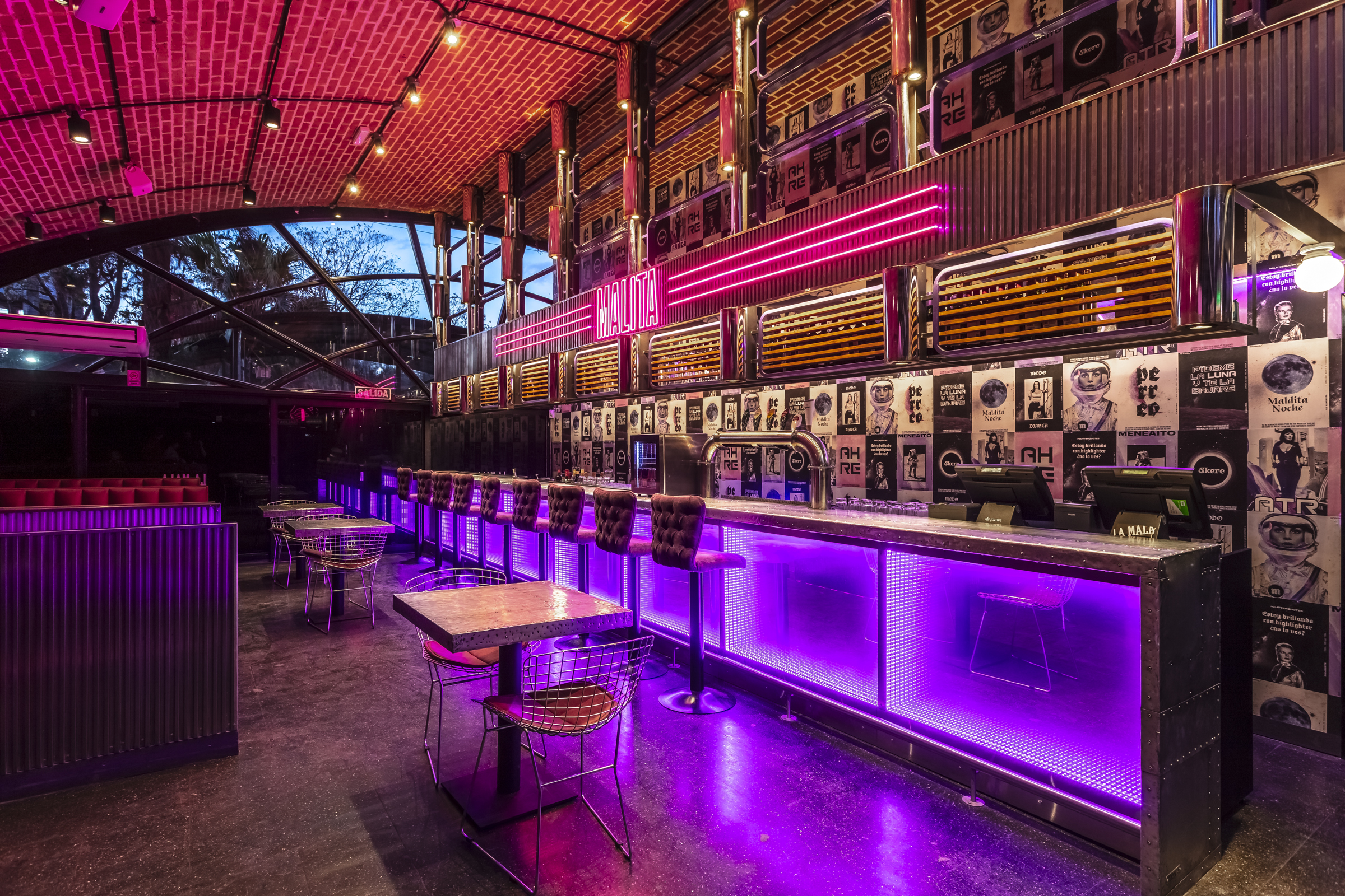
The organization of the perimetrical bars facing the outside has been decisive for a configuration that considers issues of hygiene and health.
The vegetation around the bars is not only an aesthetic feature, but it also encourages visitors to pay more attention to nature. The longitudinal formation has an active presence in all its views, especially from the park.
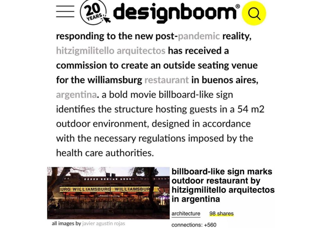
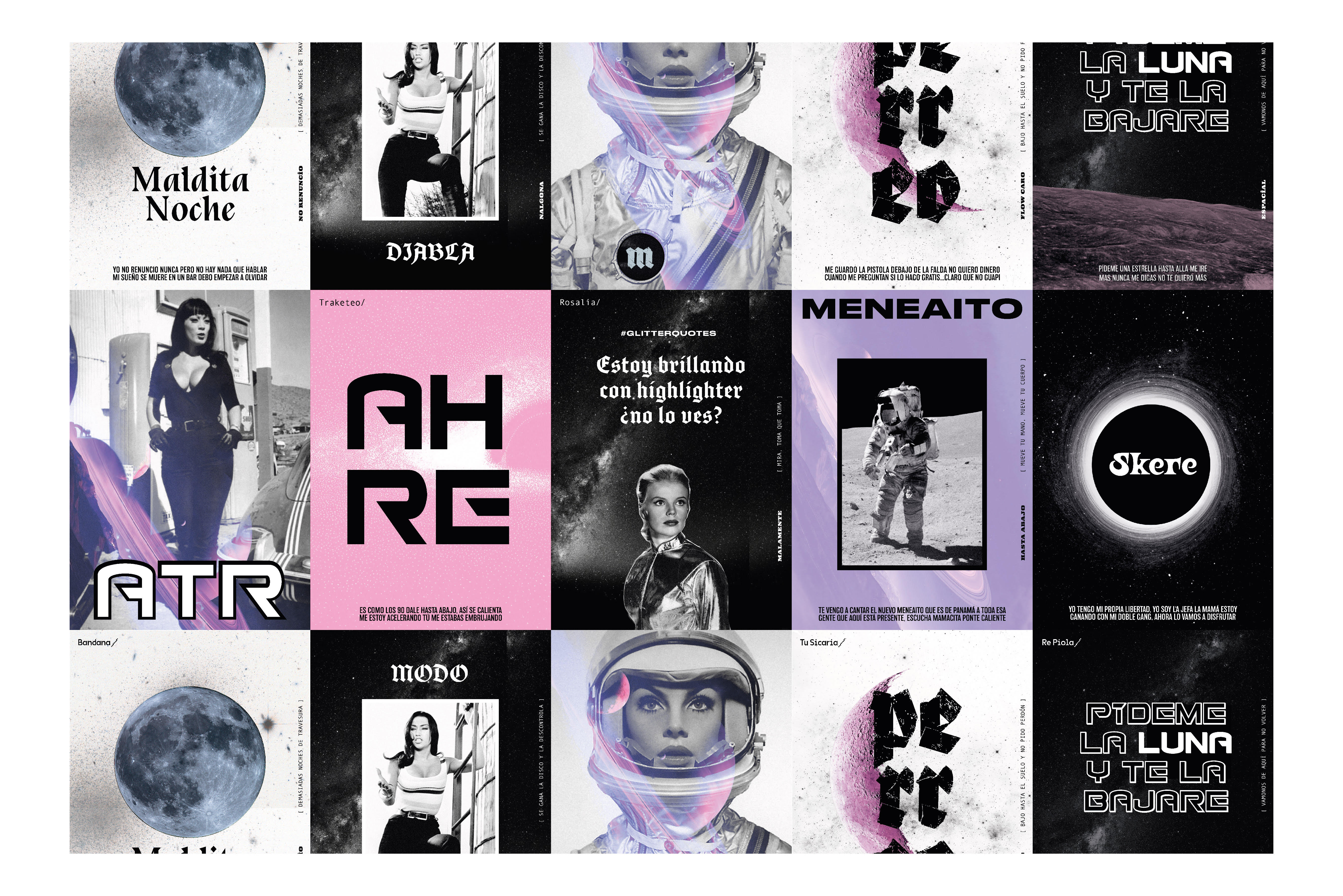
The presence of the brand is featured on top of the structure, as if it were a movie billboard from other times. The bold sign marks the identification and the character of the venue in a clear way, helping pedestrians identify the restaurant from afar.
The design is completed with fiberglass bars and circular PVC strips, both in red, adding bright pops of color to the overall metallic materiality.
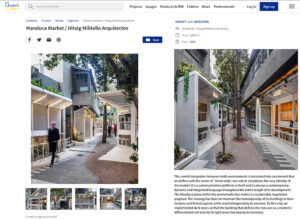
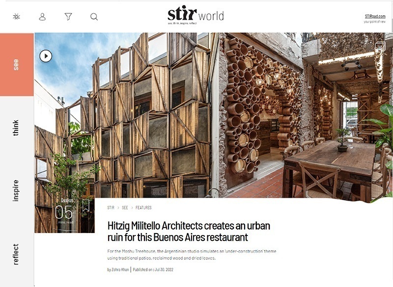
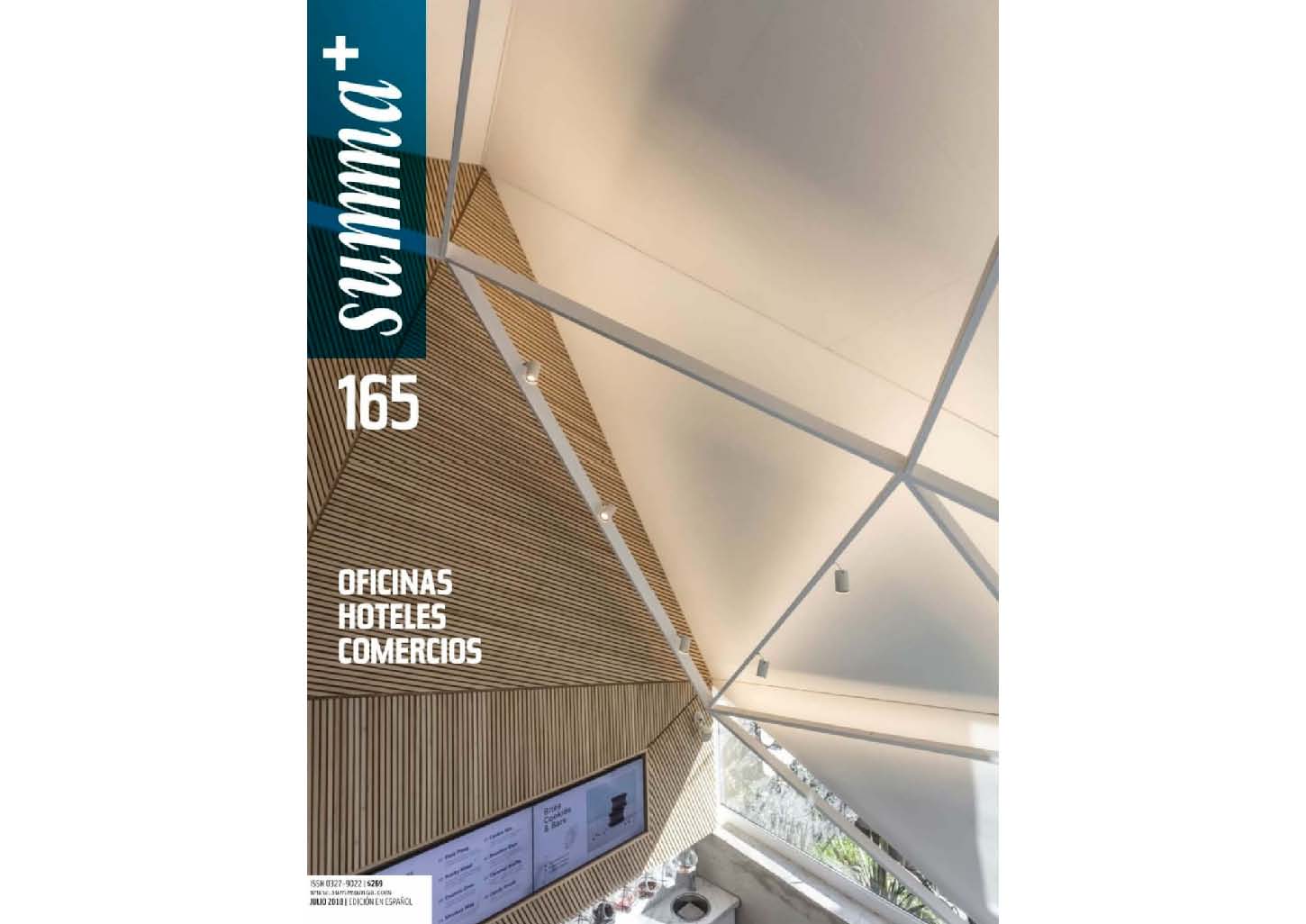
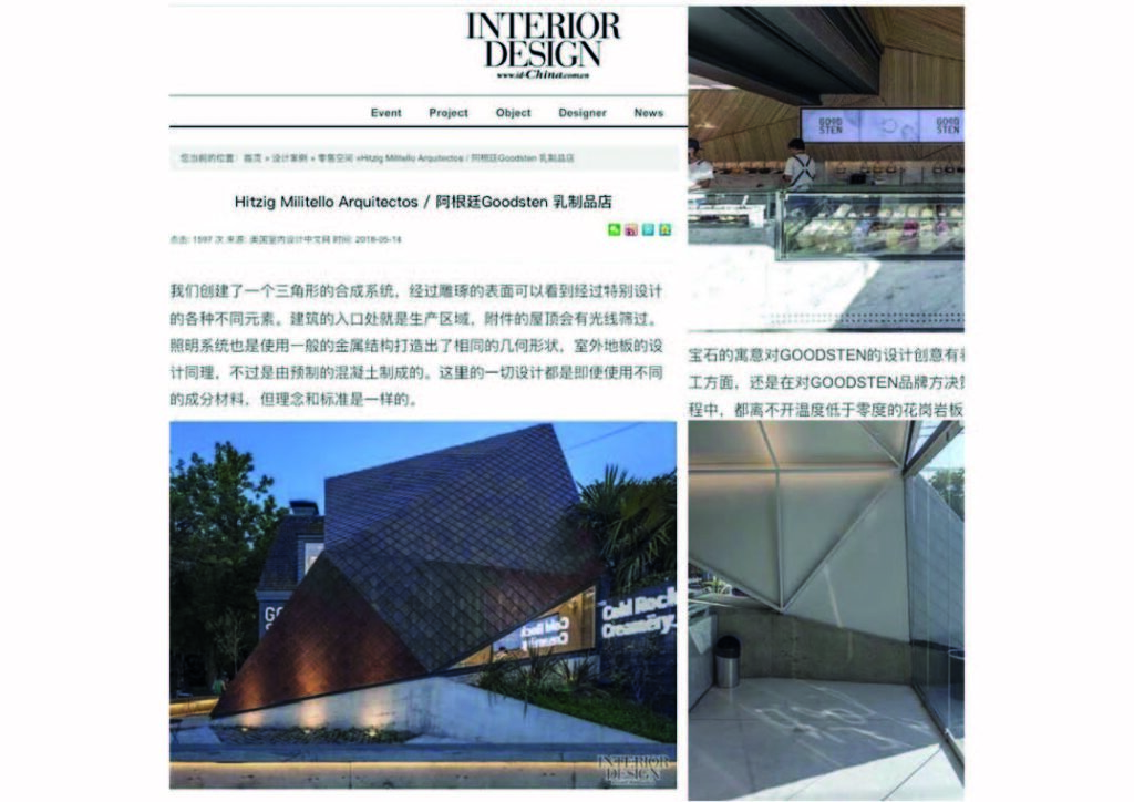
Publication
/ Local & Global


Recent Comments