The Nim Bar

/ Food & beverage

2018

Defensa 880, Buenos Aires.
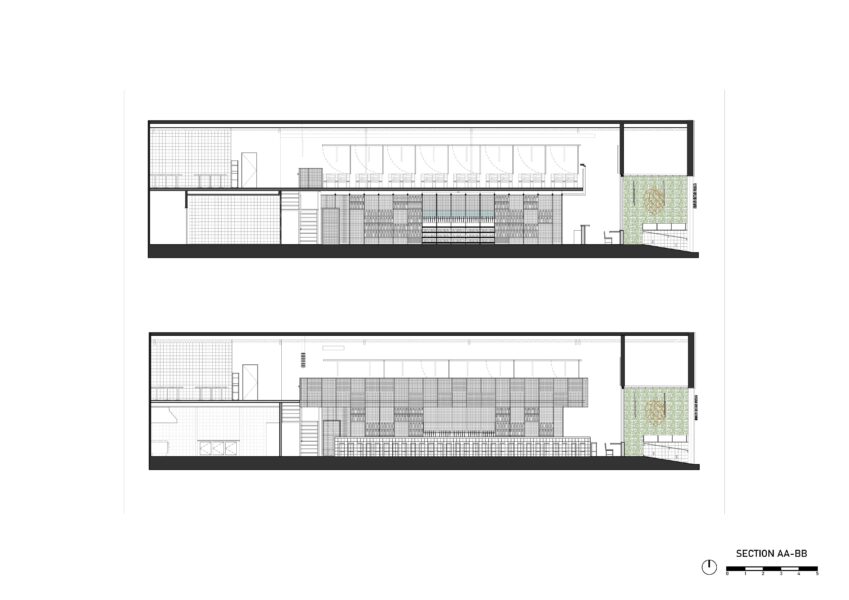
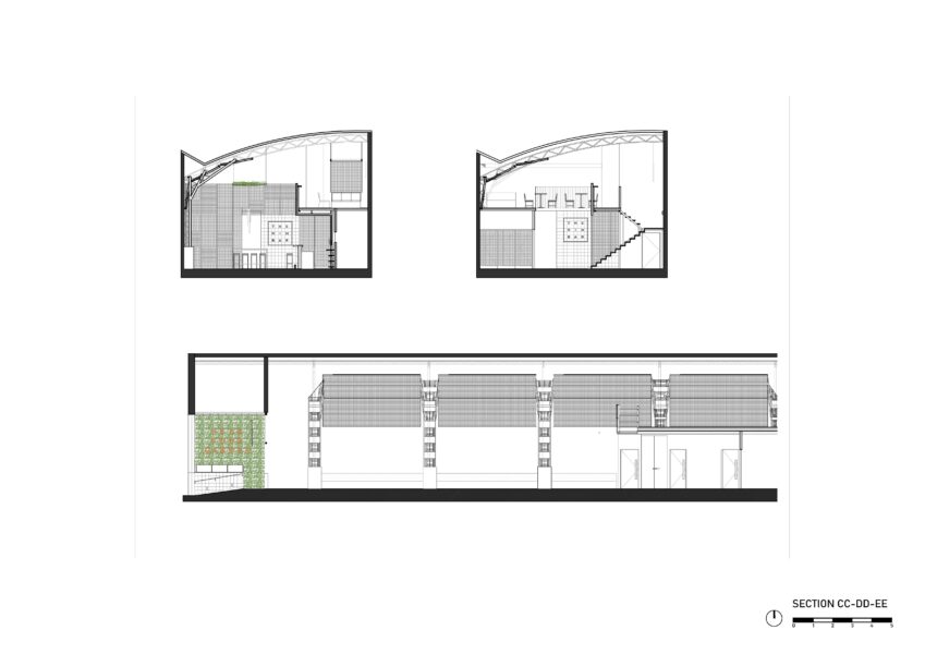
See plans >>
Project Team

Arch. Fernando Hitzig
Arch. Leonardo Militello

Construction documents:
Arch. Jeanette Zotta
Arch. Virginia Bottan

Construction Administration:
Arch. Jeanette Zotta
Arch. Virginia Bottan

Program

Food & fun beer bar

Area

Ground floor 253 sqm
Uncovered ground floor 34 sqm
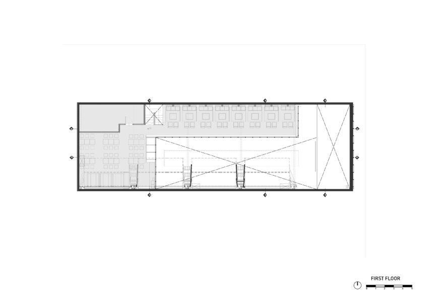
First Floor 139 sqm

Renders

Arch. Juan Ignacio Rosales
Arch. Eliana Gonzalez

Photography

Federico Kulekdjian

Services

CD

Concept Design & Art

HM Architects

DD

Design development

HM Architects

CD

Construction documents

HM Architects

CA

Construction Management & Contract Administration

HM Architects

ID

Interior design

HM Architects

Abstract

From the outset, the project had to appeal to the aesthetic dissociation of the typical beer bar. The challenge was to create a new aesthetic universe associated to the cocktail bars but without forgetting the impressive brand of 30 taps, emphasizing the idea of the largest beer bar in Buenos Aires.

The conceptual idea incorporates elements distant to the reminiscences known by beer bars. In order to refresh this idea, it was extremely important to turn to an idea of conceptualization, where the starting point was the composition of plots based on a influence of traditional proto-rationalist American style mixed up with traditional Asian interior design elements.

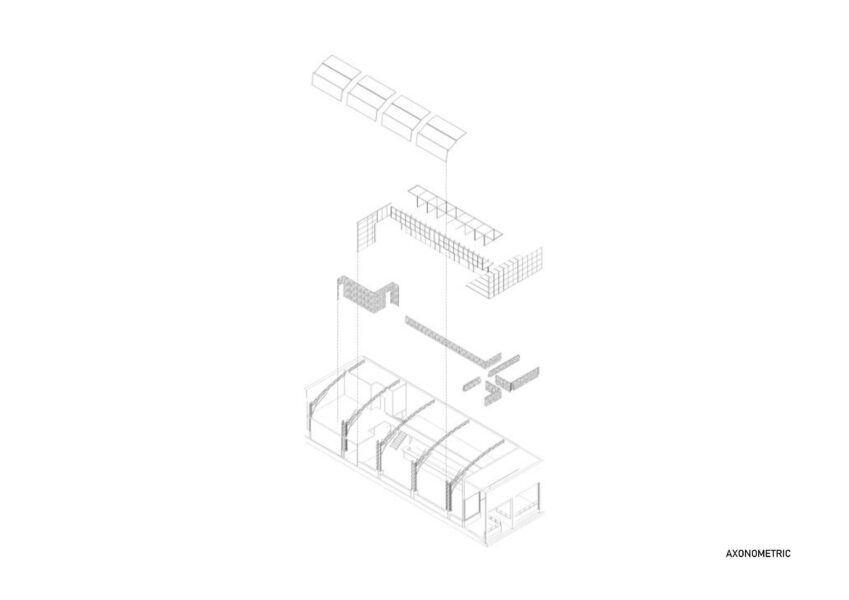
The idea was composing two types of density of wooden meshes, closed and open, in oak tones that generate multiple depths. These are definitely veils and sieves that unravel mysteries between their interstices.


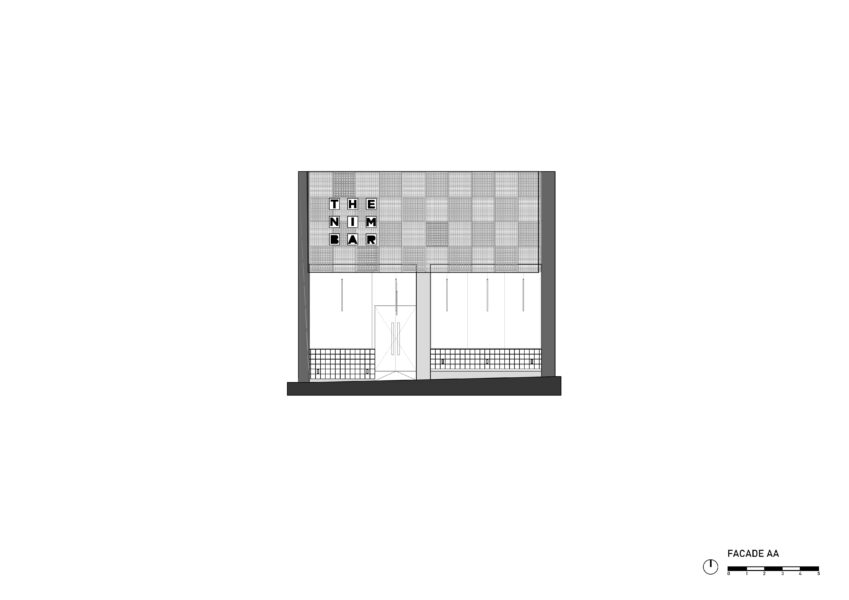
Its chess-like organization composes the closed meshes of the open ones.  Another material, but of the same compositional system, is the limestone in many of its walls. The communicative strategy on the façade proposes expressionism and a system similar to its interior.
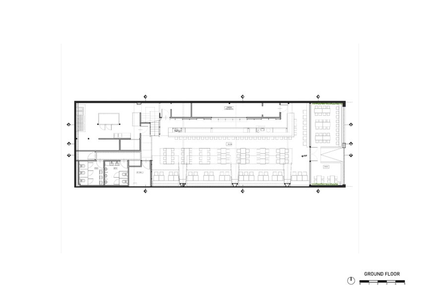
As these are high-density materials and compositions, we´ve chosen contrast them with walls impaled with neutral patterns that allow a dialogue and not a competition between designs. The design of the wallpapers is associated with a universe of plant nature, and in accordance with this there are several sectors where we have the living presence of nature, as defined in the name of the line descent.

Two plant interventions define spatiality. On the one hand, the entrance on both sides as a method of pedestrian communication, and on the other hand the long “green tongue” hanged from the ceiling divided the large central dining area.

The organization on the top floor, divided into two sectors, shows its most distinctive side in its large living-room space. These are subdivided with movable panels that swing upwards to form a large and unique space covered by a ceiling of meshes according to convenience.

The communication from its logo and isotype emulates the same system formed by a plot and background whose nature is expressed through the phoenix bird.

Publication

/ Local & Global