Uala II

/ Office

2019-20

Nicaragua 4680, Buenos Aires
See plans >>
Project Team

Arch. Fernando Hitzig
Arch. Leonardo Militello

Construction documents:
Arch. Florencia Baserga
Arch. Ailen Aljadeff

Construction Administration:
Arch. Fernando Hitzig

Program

Office

Area

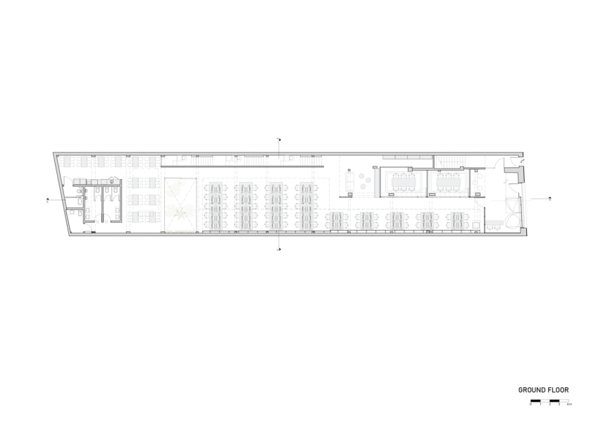
Ground Floor 375 m2
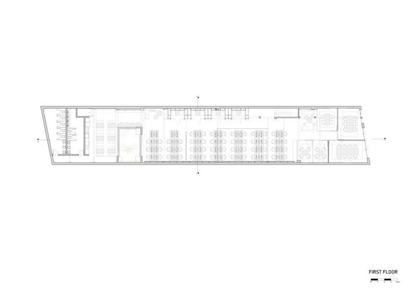
First Floor 382 m2

Photography

Federico Kulekdjian

Services

CD

Concept Design & Art

HMA Arquitectos

DD

Design developments

HMA Arquitectos

CD

Construction documents

HMA Arquitectos

CA

Construction Administration

HMA Arquitectos

ID

Interior design

HMA Arquitectos

Abstract

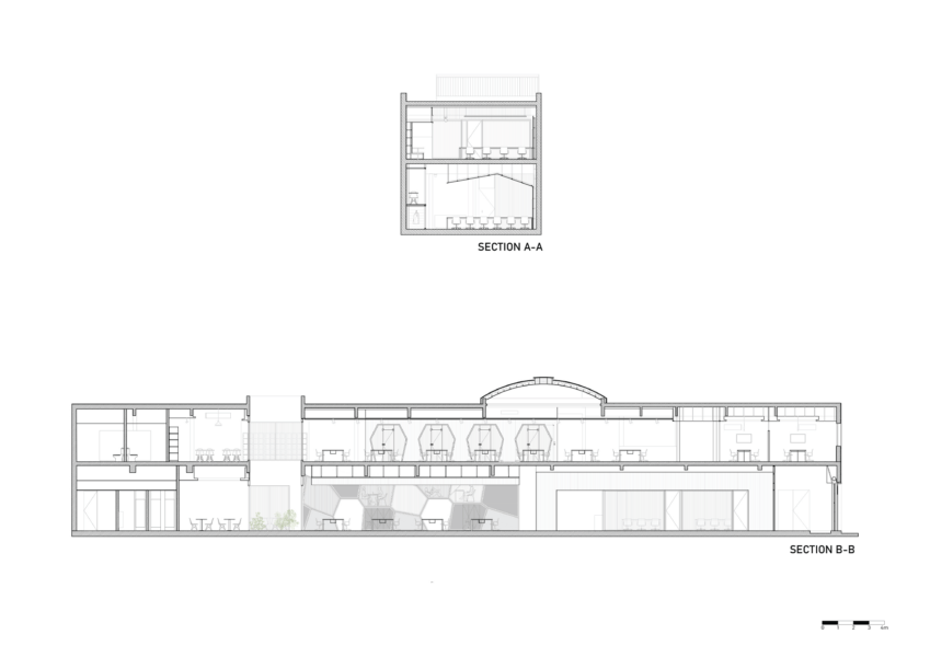
The challenge of designing work spaces always entails a special reflection on the way in which we conceive activity and the development of work. There is no doubt that architecture, in this sense, has much to contribute to the quality of life of the user. With this premise we assumed the project for the second Ualá offices. The project is organized in two large spaces joined together by a connecting corridor and a courtyard as a lung.

Based on the programmatic requirements of the client and the inherent conditions of the space to intervene – a shed in the middle of Palermo neigbourhood – the decision was to segment the total surface according to needs of use in two levels. This generated a reception area facing the main entrance, that serves as an antechamber to a large double-height space – that proposes a single place organized by work islands. This room plays the leading role in the project, giving the possibility of 60 workplaces, all with visuals to an outdoor courtyard vegetated and a vertical garden.  full of natural light.

The use of the exposed structure is part of a balance between the old building and the new intervention. The black corrugated sheet metal has a contrasting role, due to its character of contemporary material, in relation to the rustic concrete. In the same way the structure of the ceiling painted in white has a very gentle relationship, in terms of detaching itself from the existing structure through the dark tones. This chromatic change allows to understand a gap between the existing and the new intervention.

A large skin of planked dyed wood covers the walls and roof, generating a large clean space for accessories and installations. There are hidden beams, notched, electrical installations, thermomechanics, etc.

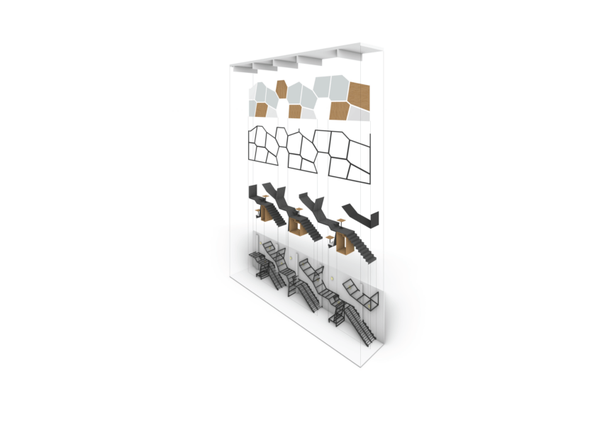
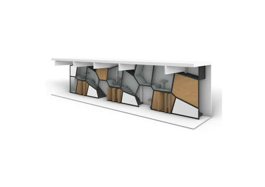
Like the first offices, this building has a space for informal meetings and relaxation. Designed as a honeycomb wall, where the interstices with spaces of use, all marked by three different materials, wood, glass and iron.

The decision to use materials, both cladding and furnishings, aims to give the space simplicity and visual calm through the use of noble materials. Both the use of building materials and furnishings, together with the study of lighting (direct / indirect / natural light) and thermomechanical conditions generate a whole that achieves ideal comfort when it comes to conceiving a work space.
Publication

/ Local & Global

Estilo Propio

Casa Linda

ARQ CLARIN

COSENTINO

Arquimaster

Archidiaries

Archidiaries

Archidiaries

Archidiaries