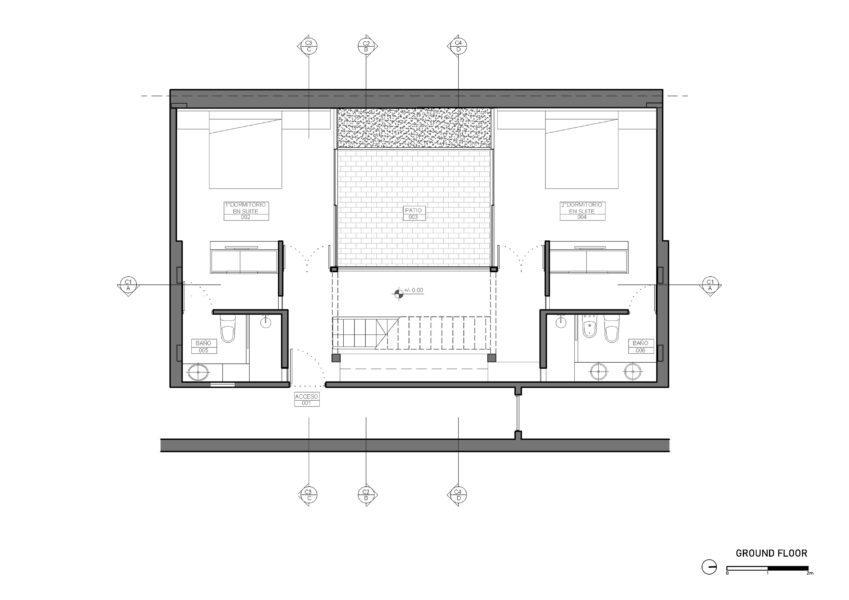
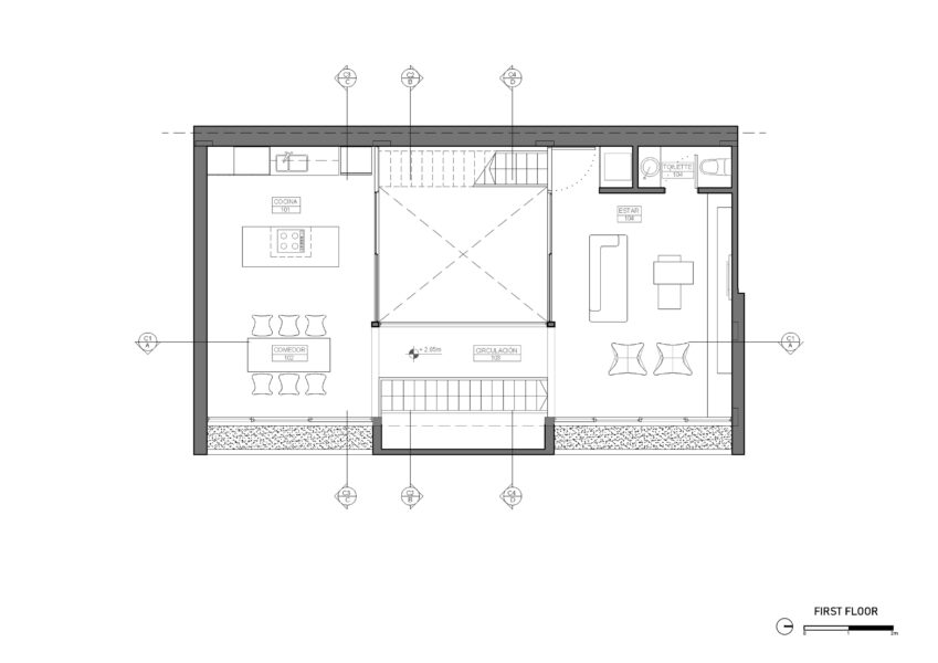
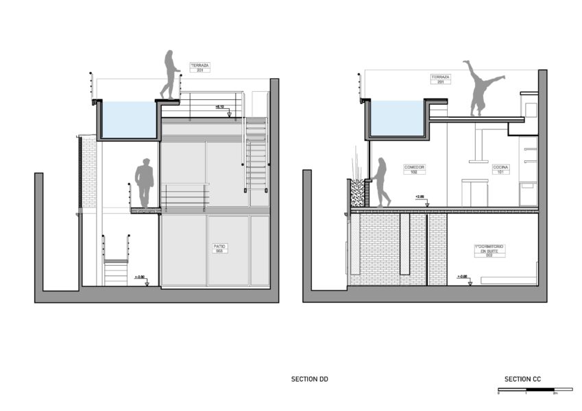
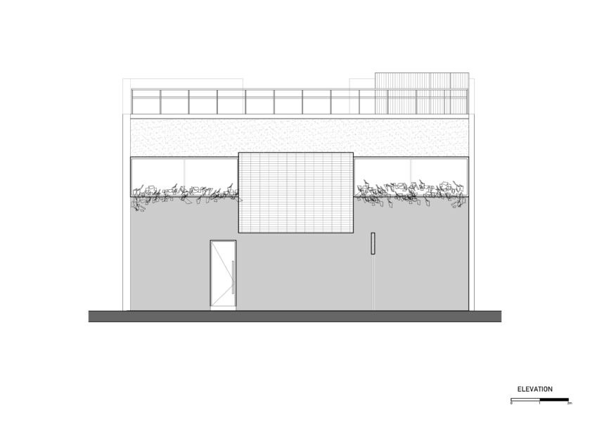
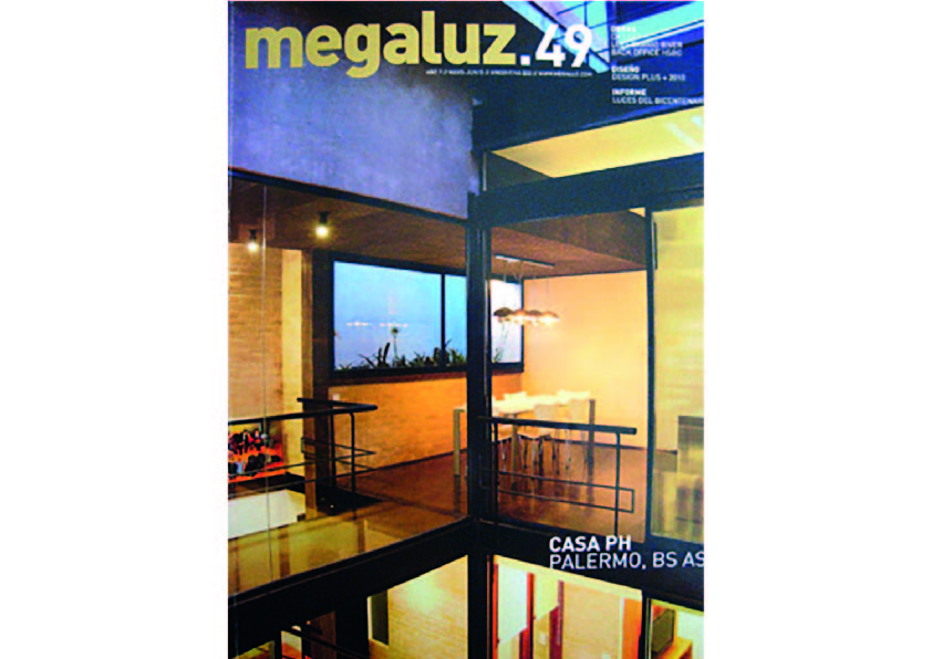
From the beginning of the project we understood the intrinsic qualities associated with this piece of urban fabric. We here deal with a rectangular space with measures that do not exceed 7.50 m x 12.00 m located practically in the heart of the square. This is a dwelling unit of the type of the row houses in the city of Buenos Aires. At the beginning of the last century it was common to build small houses with the conceptual characteristics of the “sausage house” multiplied for the depth of an urban lot. The project then rose as a challenge to customer demands whose programmatic needs far exceeded the possibilities offered by the nature of the terrain. We also had to be aware of the constraints brought by the responsibility of reforming a historic site that was protected by the law of the city of Buenos Aires.
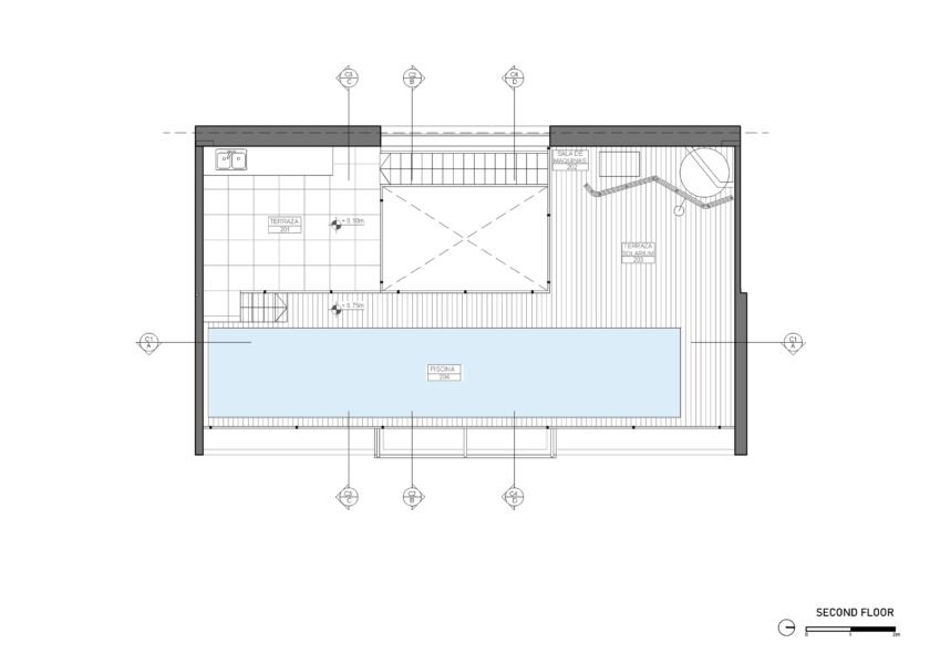
Limited to four workstations divided by only four walls, and conditioned by the small floor area, the premise of creating an interior courtyard became the alma mater of the project, following which we organized the housing, ordered the other spaces vertically upward reaching for air, light, and private visual, finishing it off with a pool deck.
The decision on the choice and use of materials reflects the same search for each space to place it in the courtyard, in a complete and honest way, creating a glazed inner skin and a solid outer skin, resulting in either both its materiality and its spatial proportions and the idea of a pavilion floor, rather than a traditional house.
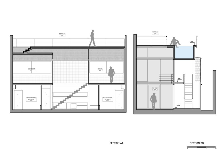
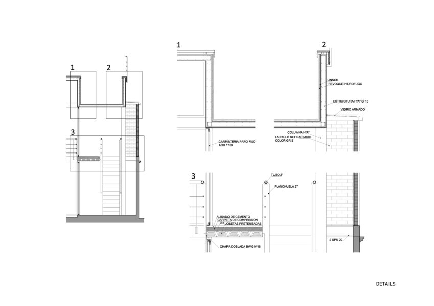
Taken to the extreme, the intention was one of generating an ethereal skin-core into the courtyard of the house, and searching for a structural, tectonic and construction that would lead us to the idea of ”disappearing” the structure and thus achieve a certain voltage determined by weightlessness based on the idea of a “floating pool” over living spaces. This idea was decisive along with that of the use of a mixed structure, with iron columns to continue the centerline of the woodwork, which is clearly opposed to the concrete volumes of marked visual presence.
The search for constructive thinking, of an architecture of noble materials, and of the use of reinforced concrete, iron and glass panels, was complemented by the decision to use refractory bricks as the sole material for partitions, in view of achieving the desired aesthetic and insulation conditions. In turn we also reused elements of the pre-existing dwelling unit which refers us to the original spirit of the property, which combined with the proposed contemporary design, constitute an added value to the project.
Regarding the links between elements, it is also interesting to look at this house. Since the refractory brick wall in the subtle touch on the existing wall (in line with this concrete column that supports the pool) the subtlety of the smithy of its columns in relation to the crystals, to frameless doors verticality to offer certain environments, everything makes a set of simple but delicate analysis in its composition.
The project was always dominated by the constant search for natural light, but it was a search which served to form the crystal clear idea of weightlessness that the volume of concrete gave the space. This element ends by sewing the project clearly always looking for a dynamic cut prefixed to static symmetry structured plant.
The movement of the housing is closely related to the courtyard and its visual crossing it vertically and spiraled from the PB, to 1P and finally to the roof. Both from the circulation and from each room of the house can see the true essence of vernacular courtyard.
The visuals to the corridor are screened by a “cushion plant” provided by planters, thanks to which provides more depth to the dividing wall on a large scale.
The skylight gives the only light that is controlled, illuminating the brick wall that frames the movement of the two levels.
The program is reversed to what is traditionally understood as private and public space as a result of understanding the character of space to live during both day and night, creating a provision that goes private in the ground floor to the public on first floor, looking for something tall, light and visual.
